This report discusses the design and production of two websites by identifying how various core design principles have been implemented in each of the websites. The two selected websites are;
All measurement have been done using a HP Envy m17 with a screen resolution of 1920×1080 pixels. The primary web browser used to test the websites is Google Chrome and Google developer tools which is an extension of Google Chrome.
|
Critical Mass |
|
|
https://www.criticalmass.com/ |
|
Salad |
|
https://saladcreative.com/ |
Both the Critical mass and Salad website are fully responsive thus the width depends on the screen size the websites are opened from. Thus opening the two websites from my browser window and using Google Chrome developer tools showed that the two websites have a width of 1920 pixels which is 100% of the browser width. All pages use a common width n both websites. Since the two websites are fully responsive, they can adapt to any of the following screen sizes;
Most devices are now running a high screen resolution thus it’s important to consider these devices when designing a website. However, the optimal width for a website is still 960px as it accommodates a lot of older devices and newer devices. However, according to Statista the global mobile internet traffic as of the second quarter 2018 is 51.89% of the total web traffic thus from this statistic most web traffic is from mobile devices (“Mobile percentage of website traffic 2018 | Statistic”, 2018). This means that the optimal website width to use is 100% of the browser width.
Both websites follow the common trend where the elements of the website extend to a 100% of the browser width. For the Salad website both the heading and the content are aligned left. The Critical Mass website uses a different alignment pattern where by the headings and the content are aligned at the center of the pages. Both websites are multi-paged thus each navigation link opens a different page.
There are different types of horizontal alignment;
The header of the Salad website consists of the logo of the website which is also the title and the navigation menu. Its 66px high and it’s pinned to the top thus to view the header from the bottom of the page you have to scroll back up. The header of the critical mass website has logo which is also the tile of the website and the navigation menu. The header is 90px high and not pinned to the top as it remains static when you scroll thus its visible even at the bottom of the page.
Both websites follow the conventional technique where the log is a link to the home page of each website. For the Critical Mass website, the Logo is centered on the header. The logo is an image with Critical Mass in black and a red underline. Hovering over the logo has no effect on the appearance of the logo. For the salad website, the logo is an image with Salad title in black. The logo is aligned on the left of the header. Hovering over the log has no effect on its appearance.
The two websites have adapted a different type of navigation. The navigation of the website Critical Mass website is a hamburger drop down menu with 9 items in it. The navigation is placed on the left most side of the header as shown in the figure below.
Clicking the menu button drops down the menu which fills the entire browser window for both desktop and mobile versions of the browser as shown in the figure below;
The font color of the links is white and hovering over each of the links produces an underline effect on the link
For the Salad website, the navigation menu is the common horizontal items aligned on the right side of the header. The color of the links and hovering over the each link changes the color of the link to red. The Salad website navigation menu adapts according to the type of device its opened from. For desktop devices or devices with large screen sizes the navigation menu remains the common horizontal menu as shown in the figure below.
For the mobile devices, the navigation menu adapts and transforms to a hamburger drop down menu aligned at the right side of the header. Clicking the drop down menu in the home page drops down the menu filling the entire browser window as shown in the figure below;
For the other pages, the navigation menu is different and does not fill the entire browser window. The background of the menu is also not black as is in the home page.
Both websites have hero content areas which is the first area that a visitor sees when they open the website (Bullock, 2017). For both websites the hero content is designed to fill most part of the browser window. Critical Mass website has only one image thus does not have a slider. The hero content displayed on top of the image is a short description of the website. The salad website has a slider which is aligned on the right. The slider is vertical thus in mobile devices the user scrolls up or down to go through the images. The slider has 6 images and there is no automatic transition thus the user to trigger the transition manually by clicking the respective manual button. Each image has a corresponding caption describing the image and a link to view more content regarding that caption.
Both websites have not implemented search functionality. This can be attributed to the fact that both websites do not have a lot of content that would require a search feature thus by using the menu the user can find all the information in the website.
Neither of the websites has implemented a sidebar in any of the pages. A review of many top websites did not include a sidebar in any of the pages thus this feature is likely not be implemented in my website.
Both websites have a footer at the bottom of every page except that the Salad website does not have a footer in the home page but all other pages have a footer. The footer of the Salad website is 336px in height and extends to 100% of the width. It uses a black background with white as the font color Content on the footer is aligned at the center of the footer. Some of the content include the links to contacts, terms and cookie policies and other social media links. This footer has contact information of the website and the partners of the website.
The critical mass website has a footer in all its pages. The footer is 159.5px and stretches to 100% of the browser width. The footer has a black background and white as the font color. The content in this footer includes contact information, a link to the careers page, social media links and copyright information.
From my review of most websites, I found out that the footer contains the contact information, social media links and the copyright information thus this is a good standard to follow when implementing my website.
The following fonts have been used in the Salad website;
Body font: ‘Graphik Web’, Arial,”Helvetica Neue”,Helvetica,sans-serif; with 16px font-size and 1.4em line height
Heading-small:17px
Heading-medium:24px;
Heading-big:31px
The font used for the critical mass website is;
Body font: Plantin W01″,”Times New Roman”,Times,serif; with 18px font size.
Font weight: 400
H1, h2, h3, h4: “Trade Gothic W01”,Helvetica,Arial,sans-serif;
Intro title; Italic, font weight 700
The critical Mass website uses a very bold and eye catching color palette with the main colors being white, black, grey and red. These colours are used interchangeably in different sections of the website. For example the background of the drop down menu is red with font color being white. Most of the heading and sub heading are red and most content sections are white with black font. The website also uses image as backgrounds which help make the design more attractive as shown in the example below;
For the Salad website, the color palette is simple but it has been implemented very thoughtfully thus resulting to a very appealing design. The primary colors used are black, white, grey and red. Red is mostly used for heading and sub headings and also when hovering over links. White is used as the background color in most of the sections with black font. Where black is used as the background color then white is the font color. Some sections have grey as the background. Images are also used as backgrounds in some sections to enhance the design of the website.
Each website has its own different type of transitions. The header of the Critical Mass website is pinned at the top immediately the user starts scrolling. Different sections of the page have different types of transitions when scrolling down. For example the title of each page slides from the bottom of the header section in animated style. This animation is also done for other sections where by the test slides from either the left or right side of the browser window. In some sections hovering over an image brings up text using an animated effect. Before a page loads, a spinner is displayed to show that the page is loading as shown in the figure below;
The salad website has fewer transitions compared to the Critical Mass website. The home page of the salad website has 6 images which transition from one image to the other depending on the slider pressed by the user. Before a page loads, a spinner is displayed to show that the page is loading as shown in the figure below;
The Salad website uses a grid based layout which is implemented differently in different sections of each page. Some sections have one box stretching t0 100% of the width while other sections have column based layout where a box can have two or three columns in a box. This strategy works out very well because it allows the designers to structure content in the page differently thus achieving a sophisticated design that is very appealing to its target audience.
The Critical Mass website uses the concept of a grid based layout where by most sections consist of one box that is occupies 100% of the width. Column based grid appearance has been used especially where there is used of images and this has helped to deliver a lot of content using images which also help enhance the design of the website.
Most of the design aspects used in both websites help create a very appealing design to the target audience. I intend to use adapt most of these design aspects in my website to achieve a similar design suited for my website.
References
Bullock, P. (2017). What is Hero Content? | Fast Web Media. Retrieved from https://fastweb.media/blog/what-is-hero-content
Mobile percentage of website traffic 2018 | Statistic. (2018). Retrieved from https://www.statista.com/statistics/277125/share-of-website-traffic-coming-from-mobile-devices/
Printwand. (2012). Basic Alignment Principles in Graphic Design (with Examples). Retrieved from https://www.printwand.com/blog/basic-alignment-principles-in-graphic-design-with-examples
Wiley, M. (2015). No Justification: Don’t Use Right, Center, and Full Justification on the Web. Retrieved from https://mrwweb.com/no-justification-dont-use-right-center-and-full-justification-on-the-web/
Essay Writing Service Features
Our Experience
No matter how complex your assignment is, we can find the right professional for your specific task. Contact Essay is an essay writing company that hires only the smartest minds to help you with your projects. Our expertise allows us to provide students with high-quality academic writing, editing & proofreading services.
Free Features
Free revision policy
$10Free bibliography & reference
$8Free title page
$8Free formatting
$8How Our Essay Writing Service Works

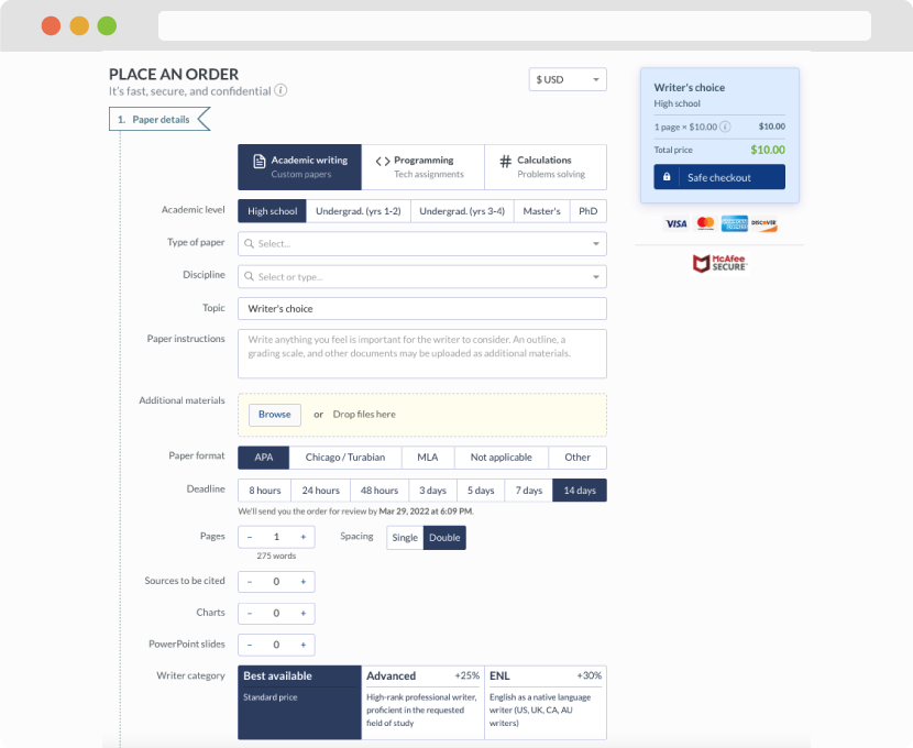
First, you will need to complete an order form. It's not difficult but, in case there is anything you find not to be clear, you may always call us so that we can guide you through it. On the order form, you will need to include some basic information concerning your order: subject, topic, number of pages, etc. We also encourage our clients to upload any relevant information or sources that will help.
Complete the order form
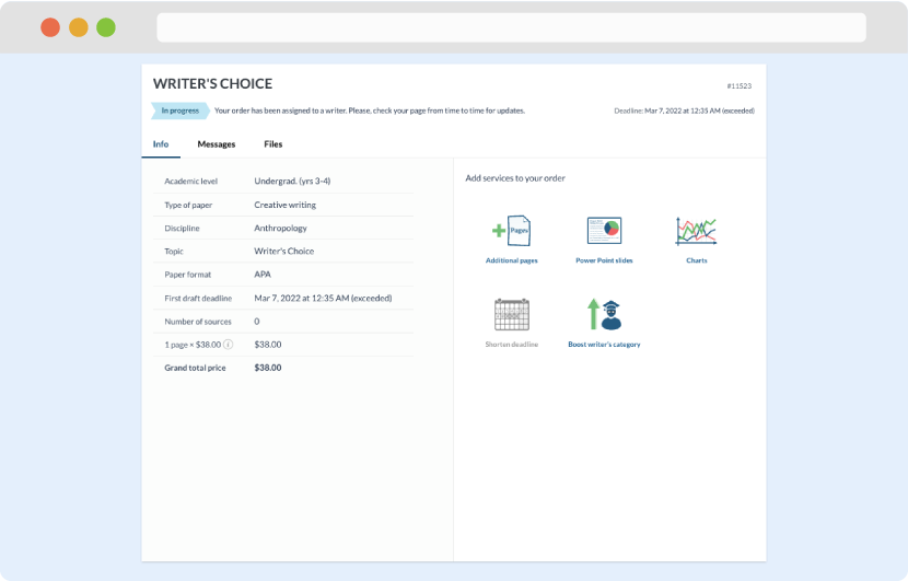
Once we have all the information and instructions that we need, we select the most suitable writer for your assignment. While everything seems to be clear, the writer, who has complete knowledge of the subject, may need clarification from you. It is at that point that you would receive a call or email from us.
Writer’s assignment
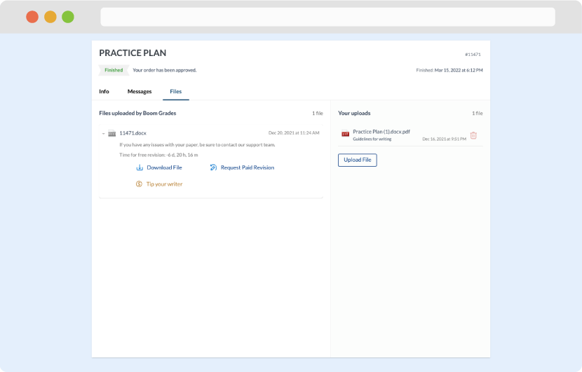
As soon as the writer has finished, it will be delivered both to the website and to your email address so that you will not miss it. If your deadline is close at hand, we will place a call to you to make sure that you receive the paper on time.
Completing the order and download