This report provide a documentation of website usability test findings for the developed Empire Institute of Education website. This test was aimed at evaluating ease of use, expression of information, test of user’s performance, identifying website design issues and evaluating navigation of website informational pages by the users of EIE website (Design, 2014).
The main objective for this testing include:
This section provides some of the finding and recommendations provided by the users that could improve the usability of Empire Institution of Education (EIE) website.
A number of usability testing was carried out on EIE website. The testing activities addressed the following questions:
Here a number of scenarios or tasks to interact with the website as they provide their findings and express their views regarding its usability (Molich, 2015). Some of the scenarios used during the testing process include:
Scenario 1
The users were required to use the top navigation menu that contains Home, Current Students, Current Staffs, Agents, Contact Us and Login Links to navigate through the website. The user were to click each navigation link one at a time and note whether the links could take them to different pages. This was to be done in all the pages in order to ensure that the user could move to a page of their choice from their current page. The navigation menu is as shown below.
Scenario 1 findings
From the above scenario, it was noted that users could navigate to any page of the EIE website efficiently without any problems (Cao, 2015). The navigation links on the main menu were satisfactory and there was no problem encountered during the process.
The major critical issue was the use of other navigation hyperlinks that could not lead to any page. These links even though they appeared in the website, their functionality was incomplete and one could not be able to link to the pages they represented. Examples of these links are: Under Students page links such as Your Course, Student Life and Student Safety as shown below.
It is therefore recommended that the incomplete links that don not lead to any web page should be completed in order to ensure that users are able to access information represented by those links. Having incomplete links denies users the access to information and it does not present the purpose or functionalities of the website fully (Wright, 2015).
Scenario 2
This scenario was aimed at gathering user’s findings on the design of the EIE website interfaces. Here the users were required to analyze the graphical user interface appearance of each web page and compare with each other to see whether consistency as a usability feature is achieved. Some of the webpages analyzed for consistency Included:
From this scenario, it was realized that the interface consistency is well observed even though not in all pages such as the Home Page. But the finding was satisfactory at a great percentage with an exception of the mention webpage.
It was therefore recommended that all pages be designed in uniformity including the home page which is the main page that every user get into contact with when visiting EIE website. This will make the website more attractive to the user and make it easy for the users to navigate through with no difficulties.
Scenario 3
Under this test, the information represented I the website was to be thoroughly analyzed in terms of text alignment, font used, and relevance of the information, text color and desired purpose. Here the test was carried out by analyzing the details of the information in each EIE website page and evaluating whether the way that information is portrayed, communicates or serve the main purpose of this website.
Findings
From this scenario it was noted that the mode of presentation of the information in different pages of this website differed. This differences ranged from the text colors used, headers consistency and paragraph alignment even though the content displayed was relevant.
For example, in Contact us page, the color used for header is blue while in Current Students page its black. Also there is a difference in the font size of the headers used. This can be seen below.
It was therefore recommended that the text color and headers font across all the pages be uniform and consistent with one another. This will improve clarity and even make the website look attractive and more professional.
There were a number of issues that could have hindered effective usability testing of this website (Kaner, 2015). Some of the limitations include:
With the limited time provided for testing, it made it impossible to test every aspect of the EIE developed website. The tester therefore could only test the main functionalities as per the requirements and not the minor links or functionalities that could result to critical errors. Also with the budget allocated to the testing process, it was not sufficient to navigate through every path of the website and carry out testing as this would require more time and resources.
This therefore calls for more time to be allocated to the testing process in future for a comprehensive testing process as well as more resources to be made available to facilitate the same.
Achieving full testing of this website was not possible due to a great number of incomplete functionalities. This was experienced in hyperlinks used in the websites such as sub links under the Staffs and students. This therefore, could not allow the tester to access such pages for the evaluation of their usability and the usability of the website in general.
The incomplete links or paths should be made functional in future in order to ensure that the tester is able to analyze all the functionalities of this website for a quality testing report.
Some of the web pages were not accessible as there was no links in the website to navigate through to the even though there are part of the website. These include: Student Portal, Teacher Portal and Admin Portal. Therefore to facilitate effective testing in future these links should be made available in the website.
The test issues that were found were rated depending on the degree of their effect on the functionality and usability of the EIE website (Bias, 2014). The issues were ranked ranges between 1 to 4 as shown below.
|
Rank |
Category |
Definition |
|
1 |
Minor |
This issue occurs once in a while and even though it does not affect the user, it is irritating. |
|
2 |
Moderate |
The user is able to complete the task but one has to take a long process to do so. There are no shortcuts. |
|
3 |
Major |
One is able to complete the task but encounters unnecessary steps. One need help to understand the website. |
|
4 |
Critical |
The user is not able to complete the task and discourages one from using the website |
Based on the above rankings, the results of this testing process can be categorized to fall under critical, major, moderate or minor error as shown below.
Under this the most critical issues that need urgent solutions included the use of incomplete navigation links representing important information regarding the students and staffs. This error can affect the main functionality of this website which is to rely information to the users and therefore if the users encounter incomplete links that do not give access to the important information, the likelihood of not wanting to visit the website again is high. Therefore critical measure of ensuring that all the navigation links are complete and provide the information needed by the user need to be taken.
It was also found that some of the information is inaccessible even though the pages are part of the website. This included the student, admin, agent and teacher portal that were to be accessed after any of these individual logs into their account. This is a major usability and functionality issue that need to be addressed as it denies users from accessing critical information. Therefore, the accessibility mechanism should be made available in order to make it easy for users to interact fully with the website.
One of the minor issue is the presentation of the information in this website. From the results obtained, some of the information was not accurately organized in terms of appearance and this could affect information clarity and discourage user from wanting to learn more. Also, the developer of this website should see to it that consistency of the interfaces is well observed as this was also another issue observed during testing.
The use of shortcuts to ease navigation process without one having to us the main menu every time is essential as it was observed that majorly the users only use the main navigation menu to visit different web pages since there are no shortcuts made available.
The table below shows a summary of the usability testing results.
|
Effect |
Example |
Recommendation |
|
Critical Issue |
Incomplete website Links |
Improve Site Navigation |
|
Major Issue |
Inaccessible Content such as student, staff and agents contents |
Make these information available for the users |
|
Moderate/Minor Issues |
Interface Consistency, Text Color, headers uniformity, page alignment |
Observe Consistency or use alternative Website Design Template. |
Conclusion
It is therefore concluded that functionality and usability testing of websites is so critical in achieving the main objectives of this particular website. It is during the testing process that errors can be determined recommendations made to improve the usability of the whole website. To have a great website therefore, it should be made easier to navigate through it, it should have consistency across all its pages, contain relevant information, have complete functionalities and provide attractive graphical user interfaces. The website should also allow the users to access information easily by observing completeness and clarity as the main features of website usability and functionality.
References
Bias, R. (2014). Website Usability Testing Report. Texas: School of Information,University of Texas at Austin.
Cao, J. (2015, January 05). Usability Testing Goals: Knowing ‘Why’ Before ‘How’. Figure out your direction before testing designs, 1-6. Retrieved February 20, 2018, from https://www.sitepoint.com/usability-testing-goals-knowing/
Design, S. R. (2014). Sample Usability Study Full Report: Retail Web Application. Sage Research & Design.
Kaner, D. C. (2015). Testing Limitations. Beginners Guide to Software Testing, 1. Retrieved February 20, 2018, from https://softwaretestingtimes.com/2015/04/testing-limitations.html
Molich, R. (2015). Usability Test of www.TowerRecords.com. DialogDesign.
Muniz, F. (2017, November 01). How does Usability Testing work? Usability Testing Examples: 4 Usability & Task Scenario Examples, 1-9. Retrieved February 20, 2018, from https://blog.testlodge.com/usability-testing-examples/
Wright, M. (2015, September 3). The Disadvantage of Incomplete Performance Feedback: Evidence from Private Equity–Backed Buyouts. Retrieved February 20, 2018, from https://papers.ssrn.com/sol3/papers.cfm?abstract_id=2670698
Essay Writing Service Features
Our Experience
No matter how complex your assignment is, we can find the right professional for your specific task. Contact Essay is an essay writing company that hires only the smartest minds to help you with your projects. Our expertise allows us to provide students with high-quality academic writing, editing & proofreading services.
Free Features
Free revision policy
$10Free bibliography & reference
$8Free title page
$8Free formatting
$8How Our Essay Writing Service Works

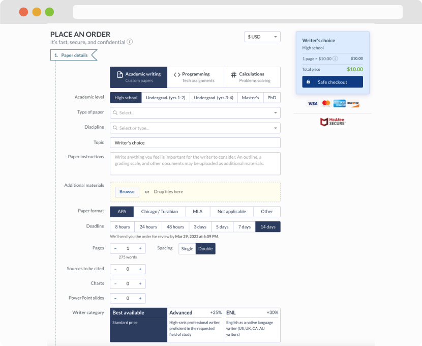
First, you will need to complete an order form. It's not difficult but, in case there is anything you find not to be clear, you may always call us so that we can guide you through it. On the order form, you will need to include some basic information concerning your order: subject, topic, number of pages, etc. We also encourage our clients to upload any relevant information or sources that will help.
Complete the order form
Once we have all the information and instructions that we need, we select the most suitable writer for your assignment. While everything seems to be clear, the writer, who has complete knowledge of the subject, may need clarification from you. It is at that point that you would receive a call or email from us.
Writer’s assignment
As soon as the writer has finished, it will be delivered both to the website and to your email address so that you will not miss it. If your deadline is close at hand, we will place a call to you to make sure that you receive the paper on time.
Completing the order and download