Data in its raw form is often incomprehensible, for instance, it is impossible to identify a trend among a number of variables in a given data-set from mere observation of the data. Equally, for anyone to be able to draw any meaningful inferences from data, more advanced measures have to be taken considerably, such measures mostly involve: data analysis, data visualization, etcetera. Bista (2018) differentiates data visualization and data analytics as: data visualization being “a way of representing data in visual form” whereas data analytics is “examining data so as to gain useful insights to draw conclusions about the data-set.” therefore data visualization are completely different, used occasionally together or independently depending on the context. In this paper, we will explore the concept of visualization and examine different visualization techniques using “Tableau” software and a relational data-set on domestic violence collected by NSW Bureau of Crime Statistics and Research, so as to establish the best data visualization technique.
The roles of visualization include:
In our paper, we will additionally compare between our choice methods of data visualization to determine which offers the most comprehensive insights given similar requirements.
Despite visualization having a number of definitions, one of the most common definitions is that of Shneiderman et al. ( 1998), in their paper they state that “visualization is the use of computer-supported, interactive, visual representations of data to amplify cognition.” Arguably, visualization is a robust tool easily used for according to Haber et al. (2011), to enable “different cognitive processes like exploratory, analytical and descriptive”
There are six steps (features) through which a quality visualization can be designed (Chittaro, 2006), which include:
The data for our study was collected by new south wales Bureau of Crime Statistics and Research. It contains records of crime statistics on a range of crimes committed between the year 2013 and 2017. The offenses are categorized into: Homicide, Domestic violence related assault, Sexual offenses, Abduction and kidnapping, Intimidation, stalking and harassment, Malicious damage to property, Breach Apprehended Violence Order. Further, the crime records are sub-divided to contain data about: summary of offenses, the time of the crime, month, premises type, alcohol related, location, victims, indigenous status, POI relationship to victim.
In this paper, we use Tableau data visualization tool to explore different visualization techniques. According to an article by Tableau (2015), tableau is “a business intelligence tool that enables creation of beautiful and visually-appealing reports, charts, graphs and dashboards.” Forbes (2017) describe Tableau as the “…grand master of data visualization software…” Due to its capability and range of productivity. As such, with the wide range of Tableau tools we will be able to explore a number of visualization techniques and answer the questions of our paper.
Visualization is divided into data and information visualization. In this paper we will explore both data and information visualization for successful decision-making will use a number of visualization techniques to explore the distribution of crimes in New South Wales different areas.
There are a number of data visualization techniques available in business intelligence, in this study we will explore methods such as: tables, bar graphs, histogram, scatter plot, area chart, pie chart, Gantt graph etcetera.
Fink (2008) describes a table as “ the arrangement of data in rows and in columns…” therefore a table is important in visualizing basic data. Generally they showcase individual statistics of interest variables.
Therefore, we realize that tables are great for outlining the general statistics of the interest data, including the specific and general statistics.
Despite their display of specific statistics about various data, tables are not useful in aiding to identify the relationship among the data variables. For instance, they do not show the regression and can not be used for comprehensive data inferences.
The above table outlines the statistics on the alleged offenders age data in relation to the crimes they are alleged to commit. The second figure shows the rank of crimes in different Wales
Alternatively referred to as column graph, the bar chart (bar graph) is among the most common means of data visualization. It is generally used to illustrate individual data series. They are categorized into:
From the bar graphs,we can give the annotation that the highest number of crime related to indecent assault and other sexual offenses are recorded for the age group of between 30 and 39. Additionally we note that the same age group has the highest number of cases related to malicious damage to property.
Bar graphs are important in representing data series and in showing the distribution of the data variable in relation to their input values. In addition they help in building on the statistics of the tables.
They do not identify any relationship among the variables and therefore can not be reliable when investigating the how the variables are related to each other.
They are characterized by three numeric parameters (Khan and Khan, 2012) signifying data points. Adobe (2002) note that “one value determines its position along x-axis, one along y-axis, and third value represent the size of the bubble in
the chart.”
Generally, the bubble chart is an improved version of a scatter plot and therefore showcases the distribution of data in relation to each other. It identifies individual distributions of the data variables.
However it only visualizes the general distribution using size of the circles and thus not suitable for complex visualization.
First developed by Cormac Kinney in the 90s, a heat map is used in visual representations of data, generally showing correlation among the data.
An article by Aura (2017) on the disadvantages of heat maps argue that heat maps “are not sensitive enough to detect differences between designs, and are particularly poor at predicting the visibility levels.” there are not exactly insightful. In our study,
Information visualization is a new development of visualization chiefly aimed at aiding the process of data exploration, evaluation, and analysis (Khan and Khan, 2012). Keim et al. (2006), on the importance its importance is that it “enforces human visual cognition, to enable the user get knowledge about the internal structure of the data, causal relationship, and dependencies in it…”
Polygons are correlative to line graphs and are therefore used to display continuous data enhancing visual interpretations of the data.
From our data most of the domestic violence offenses were recorded on Sunday, a total of 5180 cases. Polygons are used to show the relationship between different variables therefore useful in exploring multiple data variables in relation to each other. The least offenses recorded involved murder, being murder accessory. Additionally from the polygon we note that the second most recorded offenses is intimidation and malicious damage to property.
Graphs
Mostly used for scheduling, it is mainly used to show the process of event start and end.
80% of the recorded offenses totaled to than 10 thousand for offenders below the age of 49. Gantt are therefore useful for data involving time series. There were no crimes recorded in 2013 across all the regions according to the above graph
Conclusion
Following our analysis, we infer that most of the offenses involving cases such as stalking, property damage were committed by persons under the age of 30. However, most capital offenses were committed by older persons. Moreover we noted that most offenses were recorded on weekends. More importantly, is the trend of number of crime records increasing with the increase of age. Conclusively, on the various methods of data visualization, following our trial of seven methods to explore insights on the data, we can divide the methods into:
In this respect, the choice of a visualization method is dependant on the needs of the business problem or data analyst. For instance if one wishes to specifically explore the distribution the data they may opt to adopt a bubble graph or scatter plot, or, if they wish to explore the relationship between variables, they may opt for a heat map or polygon. The bottom-line of the choice of a method for data visualization is the specific requirement that suits the decision makers. Ideally the various visualization methods can be used for providing insight on large data-sets, some such as tables for use on providing specific statistics and others such as polygons to provide general inferences. Therefore multidimensional data is best explored with suitable tools as demonstrated in our study.
Zach Gemignani, (2010). “Better Know a Visualization. Parallel Coordinates. [Online]. Available at: www.juiceanalytics.com/writing/parallel-coordinates/. accessed on 31st may 2018.
Howitt, D. and Cramer, D. (2008). Introduction to Statistics in Psychology.Prentice Hall.
Alfred, T. (2009). Parallel Coordinates: Visual Multidimensional Geometry and Its Applications,Springer.
Muzammil, K.and Shah, K.(2012). Data and Information Visualization Methods, and Interactive Mechanisms.International journal of computer applications.Vol. 34, No.1, pp 23-44.
Andy, C and Bruce, M, (2000). An evaluation of cone trees. In People and Computers XIV: British Computer Society Conference on Human Computer Interaction. Springer Verlag, pages 425–436.
Thomas,J. J. and Cook, K. A. (2006). A Visual Analytics Agenda, Journal Transactions on Computer Graphics and Applications, Vol. 26 No.1, pp12–19
Muzammil K, Mushtaq R, and Nasir R. (2010). Appropriate Length of Text Line with Special Relationship to Eye Blink to Reduce Maximum Focus Loss. Journal of International Conference on Internet Computing, Vol. 32, No. 1, pp 97-102
Essay Writing Service Features
Our Experience
No matter how complex your assignment is, we can find the right professional for your specific task. Contact Essay is an essay writing company that hires only the smartest minds to help you with your projects. Our expertise allows us to provide students with high-quality academic writing, editing & proofreading services.
Free Features
Free revision policy
$10Free bibliography & reference
$8Free title page
$8Free formatting
$8How Our Essay Writing Service Works

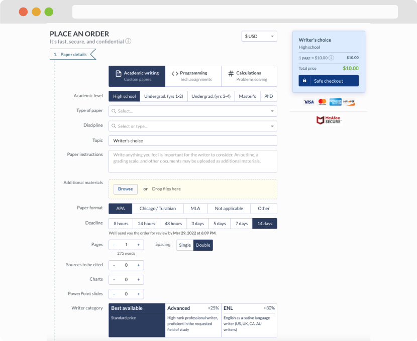
First, you will need to complete an order form. It's not difficult but, in case there is anything you find not to be clear, you may always call us so that we can guide you through it. On the order form, you will need to include some basic information concerning your order: subject, topic, number of pages, etc. We also encourage our clients to upload any relevant information or sources that will help.
Complete the order form
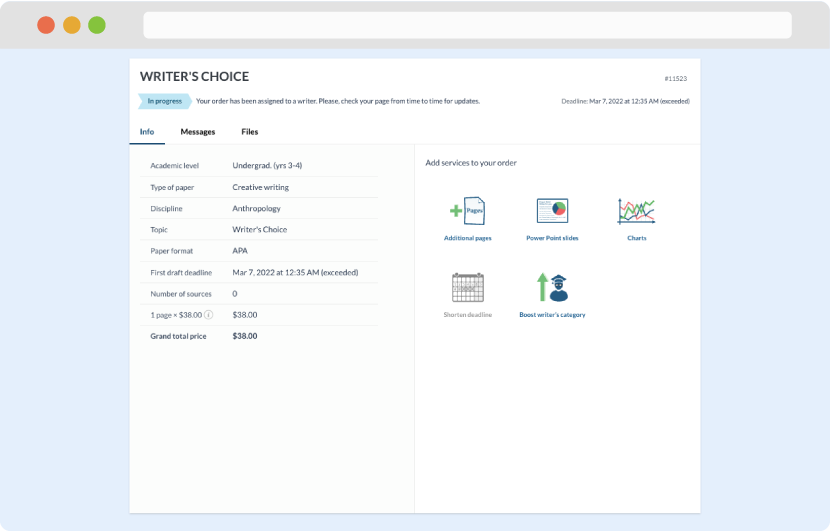
Once we have all the information and instructions that we need, we select the most suitable writer for your assignment. While everything seems to be clear, the writer, who has complete knowledge of the subject, may need clarification from you. It is at that point that you would receive a call or email from us.
Writer’s assignment
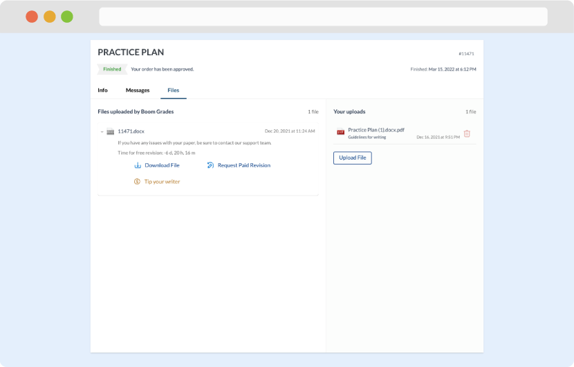
As soon as the writer has finished, it will be delivered both to the website and to your email address so that you will not miss it. If your deadline is close at hand, we will place a call to you to make sure that you receive the paper on time.
Completing the order and download