This report presents the findings from the analysis of the health and population data of Papua New Guinea. The analysis will cover the period from the year 2000 to the year 2015. The analysis aims at observing and identifying trends and relationships that may exist in the data and presenting findings that can be of value for other professionals.
The data used for the analysis in this report was obtained from the World Bank as Health and Population.csv. The data was then preprocessed to focus on the specific datasets on Papua New Guinea. The new data was then filtered to remain with six variables; Birth Rate, Death Rate, Unemployment Rate, Fertility Rate, Government Health Expenditure and Life Expectancy at Birth. The analysis involved three single variable analysis, two 2- variable analysis, a cluster analysis using k-means clustering and two linear regressions.
The findings presented from the analysis in this report focus mainly on Papua New Guinea and thus can only be considered as relevant for the country and cannot be used as reference for other countries. Although there could be an exception for countries with similar characteristics such as population size, income level and geographical location.
Secondary data was used for this report. The analyzed data was obtained from the World Bank as Health and Population.csv. Using excel the data was filtered to obtain the data on Papua New Guinea based on the six variables; Birth Rate, Death Rate, Unemployment Rate, Fertility Rate, Government Health Expenditure and Life Expectancy at Birth.
The new data is then imported into R using the code below:
#Importing the Papua New Guinea data into R as PNGData
PNGData <- read.csv(“C:/Users/user/Documents/HNP WB DATA/PNGSpecifiedData.csv”, header = T)
PNGData <- PNGData[,c(3,45:60)]
PNGData
To cater for the missing values, the analysis focused on the data from the years 2000 to the year 2015. This ensured a complete and continuous dataset that will be sufficient for providing reliable analysis.
The following code transposed the data to convert the variables into columns from rows:
#Intializing the Year, Birth Rate, Death Rate, Govt Health Expenditure, Fertility Rate,
#Life Expectancyat Birth and Unemployment as vectors
Year <- c(2000:2015)
Birth.Rate <- c(PNGData[1,])
Death.Rate <- c(PNGData[2,])
Govt.Health.Expenditure <- c(PNGData[3,])
Fertility.Rate <- c(PNGData[4,])
Life.Expectancy.At.Birth <- c(PNGData[5,])
Unemployment <- c (PNGData[6,])
#Forming a matrix for the initialized vectors of variables
PNGData1 <- matrix(c(Year,Birth.Rate,Death.Rate,Govt.Health.Expenditure,Fertility.Rate,
Life.Expectancy.At.Birth,Unemployment), ncol = 7, byrow = F)
#Naming the columns for the matrix
colnames(PNGData1) <- c(“Year”, “Birth.Rate”,”Death.Rate”,”Govt.Health.Expenditure”,
“Fertility.Rate”,”Life.Expectancy.At.Birth”,”Unemployment”)
#Forming the data frame for the matrix
PNGData1 <- data.frame(PNGData1)
PNGData1 <- PNGData1[c(1:16),]
PNGData1
This was achieved through first initializing all the variables as vectors i.e. converting all the rows in the PNGData into vectors. These vectors then formed the columns of a matrix, which is converted into a data frame to form the PNGData1 dataset.
The resultant data, PNGData is now in a format that can be analyzed.
The analysis of the Birth Rate in Papua New Guinea from the years 2000 through to the year 2015 produced the plot below in figure 1. The R Code used to generate the plot is given below:
#Plotting the Birth Rate in Papua New Guinea
plot(PNGData1$Year, PNGData1$Birth.Rate, xlab = “Year”, ylab = “Birth Rate”, type = ‘l’,
main = “Birth Rate of Papua New Guinea (2000 – 2015)” )
The analysis of the Death Rate in Papua New Guinea from the years 2000 through to the year 2015 produced the plot below in figure 2. The R Code used to generate the plot is given below:
#Plotting the Death Rate in Papua New Guinea
plot(PNGData1$Year, PNGData1$Death.Rate, xlab = “Year”, ylab = “Death Rate”, type = ‘l’,
main = “Death Rate in Papua New Guinea (2000 – 2015)”)
The resultant plot is as below:
The analysis of the unemployment in Papua New Guinea from the years 2000 through to the year 2015 produced the plot below in figure 3. The R Code used to generate the plot is given below:
#Plotting the Unemployment in Papua New Guinea
plot(PNGData1$Year, PNGData1$Unemployment, xlab = “Year”, ylab = “Unemployment”, type = ‘l’,
main = “Unemployment in Papua New Guinea (2000 – 2015)”)
we observe that the unemployment rate in Papua New Guinea does not have a definable trend. The unemployment rate was on a decline between the years 2000 and 2010. It then spiked from 2010 to 2011 before relatively flattening out between 2011 and 2015.
The analysis of the relationship between the Birth Rate and the Death Rate in Papua New Guinea produced the plot in figure 4 below. The R Code used to generate the plot is as given below:
Plotting the Birth Rate against the Death Rate
plot(PNGData1$Birth.Rate, PNGData1$Fertility.Rate, xlab = “Fertility Rate”, ylab = “Birth Rate”,
type = ‘l’, main = “Birth Rate against the Death Rate (2000 – 2015)”)
The resultant plot is as below:
The plot indicates a direct linear relationship between the birth rate and the fertility rate in Papua New Guinea. This suggests that and increase in the fertility rate results in the increase in birth rate in Papua New Guinea.
The analysis of the relationship between the Death Rate and the Government Health Expenditure in Papua New Guinea produced the plot in figure 5 below. The R Code used to generate the plot is as given below:
#Plotting the Death Rate against the Government Health Expenditure
plot(PNGData1$Govt.Health.Expenditure, PNGData1$Death.Rate, xlab = “Govt Health Expenditure”,
ylab = “Death Rate”, main = “Death Rate against the Government Health Expenditure (2000 – 2015)”)
The plot in figure 5 above does not indicate any real linear relationship between the Government Health Expenditure and the Death Rate in Papua New Guinea. However, the plot does show a decrease in the death rate with increase in the Government Health Expenditure. Thus, implying that an increased investment in the Health Expenditure would be a good way of eventually reducing the death rate in Papua New Guinea.
Advanced analysis was carried out through clustering of the Papua New Guinea Dataset. The clustering was done using the k-means method.
The R Code used to generate the clusters is as given below:
#Clustering the Papua New Guinea data
#Loading The Cluster Package
library(cluster)
set.seed(20)
Clusters <- kmeans(PNGData1[2:3,],5)
Clusters
#Plotting the Clusters
clusplot(PNGData1, Clusters$cluster, color=T, shade=T,
labels=2, lines=0)
The code above separated the periods 2000 to 2015 into 5 clusters. Table 1 below represents the output of the clustering of the Papua New Guinea Dataset:
K-means clustering with 5 clusters of sizes 3, 3, 4, 3, 3
Cluster means:
Birth.Rate Death.Rate
1 29.50433 7.236667
2 30.83967 7.394333
3 33.45100 8.125000
4 32.11200 7.684333
5 28.29500 7.155333
Clustering vector:
1 2 3 4 5 6 7 8 9 10 11 12 13 14 15 16
3 3 3 3 4 4 4 2 2 2 1 1 1 5 5 5
Within cluster sum of squares by cluster:
[1] 0.3808153 0.4070613 0.7141440 0.3530327 0.2697787
(between_SS / total_SS = 96.5 %)
Available components:
[1] “cluster” “centers” “totss” “withinss” “tot.withinss” “betweenss”
[7] “size” “iter” “ifault”
Table 1
From the plot above we observe that one of the clusters, cluster 1 above is bigger that the other 4.
Linear regression is described by (Faraway, 2006) as y=Xβ+ε, the relationship between an independent variable X and a dependent variable y.
In this report, we analyze the relationship between two pairs of variables as in below:
The R Code used for generating the linear model for Fertility Rate on Birth Rate is as below:
#Unlisting the Birth Rate and Fertility Rate data variables and storing in ModelData1
Model1Data <- data.frame(BirthRate = unlist(PNGData1$Birth.Rate),
FertilityRate = unlist(PNGData1$Fertility.Rate))
#Generating the linear model for Fertility Rate on Birth Rate
Model1 <- lm(BirthRate ~ FertilityRate, data = Model1Data)
Model1
#Plotting Model1 and its variables
plot(Model1)
The data variables, Fertility Rate and Birth Rate are first unlisted to enable modelling.
The resultant output of the linear regression model is given in table 1 below:
Call:
lm(formula = BirthRate ~ FertilityRate, data = Model1Data)
Coefficients:
(Intercept) FertilityRate
-0.02953 7.53036
Table 2
From table 1 above, we can conclude that the linear model is given by:
BirthRate = -0.02953 + 7.53036FertilityRate
The model implies that the Fertility Rate has a positive impact on the Birth Rate, thus positive correlation. This is observed from the positive coefficient of the Fertility Rate = 7.53036.
The model also implies that at Fertility Rate = 0, the Birth Rate stands at -0.02953.
Linear Model for Govt Health Expenditure on Life Expectancy At Birth
The R Code used for generating the linear model for Fertility Rate on Birth Rate is as below:
#Unlisting the Life Expectancy At Birth and Govt Health Expenditure data variables and
#storing in ModelData2
Model2Data <- data.frame(LifeExpectancyAtBirth = unlist(PNGData1$Life.Expectancy.At.Birth),
GovtHealthExpenditure = unlist(PNGData1$Govt.Health.Expenditure))
#Generating the linear model for Govt Health Expenditure on Life Expectancy At Birth
Model2 <- lm(LifeExpectancyAtBirth ~ GovtHealthExpenditure, data = Model2Data)
Model2
#Plotting Model2 and its variables
plot(Model2)
The data variables, Government Health Expenditure and Life Expectancy At Birth are first unlisted to enable modelling.
The resultant output of the linear regression model is given in table 2 below:
Call:
lm(formula = LifeExpectancyAtBirth ~ GovtHealthExpenditure, data = Model2Data)
Coefficients:
(Intercept) GovtHealthExpenditure
61.75394 0.04434
Table 3
From table 2 above, we can conclude that the linear model is given by:
Life Expectancy At Birth = 0.04434 + 61.75394Government Health Expenditure
The model implies that the Government Health Expenditure has a positive impact on the Life Expectancy At Birth, thus positive correlation. This is observed from the positive coefficient of the Government Health Expenditure = 61.75394
The model also implies that at Government Health Expenditure = 0, the Life Expectancy at Birth stands at 0.04434.
The resultant Normal Q-Q plot is given in the figure 7 below:
References
Faraway, J. J. (2006). Extending The Linear Model with R (1st ed.). New York: Chapman & Hall/CRC.
Galit, S., Peter, B. C., Inbal, Y., & Nitin, P. R. (2018). Data Mining for Business Analytics (1st ed.). John Wiley & Sons, Inc.
Essay Writing Service Features
Our Experience
No matter how complex your assignment is, we can find the right professional for your specific task. Contact Essay is an essay writing company that hires only the smartest minds to help you with your projects. Our expertise allows us to provide students with high-quality academic writing, editing & proofreading services.
Free Features
Free revision policy
$10Free bibliography & reference
$8Free title page
$8Free formatting
$8How Our Essay Writing Service Works

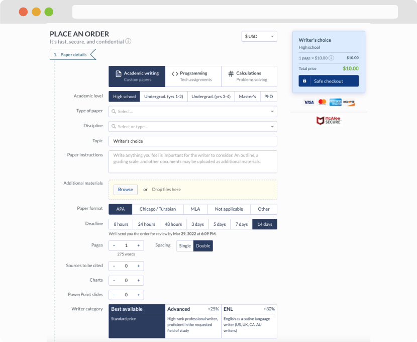
First, you will need to complete an order form. It's not difficult but, in case there is anything you find not to be clear, you may always call us so that we can guide you through it. On the order form, you will need to include some basic information concerning your order: subject, topic, number of pages, etc. We also encourage our clients to upload any relevant information or sources that will help.
Complete the order form
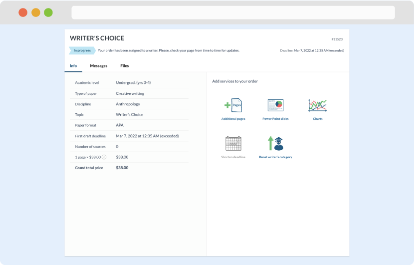
Once we have all the information and instructions that we need, we select the most suitable writer for your assignment. While everything seems to be clear, the writer, who has complete knowledge of the subject, may need clarification from you. It is at that point that you would receive a call or email from us.
Writer’s assignment
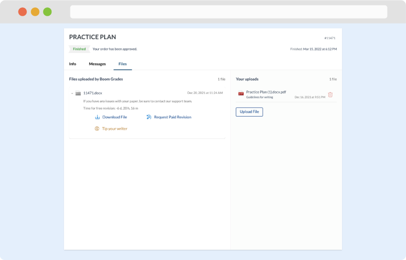
As soon as the writer has finished, it will be delivered both to the website and to your email address so that you will not miss it. If your deadline is close at hand, we will place a call to you to make sure that you receive the paper on time.
Completing the order and download