The website development is very important and therefore the reason to do test for this website is in order to ensure that website that is being nominated responsive enough, its design and interfaces is good and it can interact well by users (Shitkova,2015).
To do all these a tool named as simulator which is called Responsive web design tester Chrome device simulator is used to all the developing team test the appearance of this device in various devices screen layouts.
After simulation of the nominated website ,the below screen of the website in various devices are obtained where the respective devices varies with sizes and resolutions as well (Gómez, 2014).
During the testing process the websites responsiveness ,one website was selected by name https://www.newsweek.com/ where it was tested for the responsiveness features ,this website is news based website where the various local news, magazines and international news are displayed here (Sauro,2012).
There are various website feature that are in this https://www.newsweek.com/ website which perform various functions, among those features are:
This website has good features that allows it to be more user friendly ,therefore there are some positive and negative features as below:
The below are few positive features of the website:
Below are some of the negative features and aspects of this website.
Two other persons to review the nominated website.
During the review process there are other reviewer who were involved in review process and the following were some of their different reviews .
First Reviewer
Age 37 :years
Gender :Male
Profession: Teacher
The reviewer is my class mate where he came up with some different reviews where he suggested that instead of using multiple images ,there is a need to put a slideshow type of a banner at the top part of each webpage.
Reviewer 2
Age 21 years
Gender :female
Profession :computer science
This is a reviewer who is a friend ,where he reviewed that the website was slow in loading in relatively all devices ,therefore he recommended use of optimization methods to improve the loading speed of the website in various devices.
The responsive web design tester is a tool used to simulate appearance of various devices it has various advantages which includes.
The mobile devices of late had improved the traffic in the websites according to the new research ,this is therefore important to have developers who could deliver responsive devices ,this makes the layout for all devices to fit well and thus the cost for developing various versions is lowered and the development cost is also highly reduced.
The responsive website design ensures that there is very little time spent instead of making any stand alone applications ,this responsive website usually spares the money that could have been used in making stand alone applications and also minimizes on the cost involved .
To implement two or more websites requires more time to do test and do maintenance ,however the responsive design make the website to be responsive for each and every devices screen. However responsiveness makes the devices to be fitted by one designed screen ,this improves services to the owners of business, customers and the developers this ensures that only little time is spent in maintenance of the website
The responsive websites are great in that the visitors tends to stick to websites, however while the website takes more than three second the users tends to run away from using it ,where it takes long time to load in both phones and tablets where the visitors tend to be frustrated and they opt for other websites.
The visitors of responsive websites enjoys in that they always get very great experience ,this encourages them to use the website for a longer duration since all site areas are great, however when the website is not responsive the visitors tends to visit the competitors sites.
The rate of bouncing is not enough to get the results, however the best approach is to ensure that the devices are consistent while accessing the website. Therefore by giving a website which is secure and is designed professionally and thus the users cannot move to the respective competitors.
This is meant to check how is the website traffic ,this enables them to make changes and ensure there is improvement in terms of the system interaction ,this will enable the developers know how the devices could perform while being accessed by various devices.
The Responsive web design is a very important aspect in terms of the optimizing the website while searching any content ,the single responsive for all devices make sure that the content is not duplicated which could lower the rank while searching a website.
This responsiveness give a good impression to the users of the devices ,this is when they use either the phones ,tablets or computers ,this makes them enjoy the experience where the users do not need to resize the web pages to fit the devices layout.
There are various phones ,tablets and computers which are responsive and they make it easy for users to view the any Html 5 content even when they are not connected to internet.
However below are some of the disadvantages associated with it which includes:
The responsive design mainly is the best in use by the HTML 5 and the use of the css style ,where the various devices can be able to load the websites data ,however there is a large percentage of webpage which is hidden while trying to display in other devices like the mobile phones or even the tablets ,above that there tends to be a delay while displaying data but can be improved only while using the 3g type of network.
According to various devices to be used with their respective contexts where the various devices including the computers and the mobiles where some needs of the users are omitted and not all features are put into considerations.
There are some browsers that tend not to support some devices ,where some old fashions of the phones and computer browsers tends to be selective. This design for responsive devices is not best especially where the users have the previous devices versions ,which do not support the Html5 and its tags.
The website design is not badly of since it has provision of the required information however ,for the purpose of use and interaction there are few recommended changes where the website should be added better design which is more attractive to the users, also the website sidebar link or menu should be placed on top left for easy access by the users .
However I could recommend also the social sites links like the facebook be made colorful and also they should be placed at the footer part of the webpage.
Conclusion
The web designing is very vital in day to day activities in that ,there is introduction of new devices which range from smartphones ,tablets and computers where they do support most of HTML5 applications ,therefore in order to cater for all the users of these devices it is recommended that a responsive website to be developed where all devices can fit and also their resolution is perfect .In conclusion the responsive website is efficient, saves on time ,improves service delivery, and also saves on the development cost (Zhang,.2015).
References.
Zhang, D.2015. Challenges, methodologies, and issues in the usability testing of mobile applications.Cambridge, England: Cambridge University Press.
Shitkova, M.2015. Towards usability guidelines for mobile websites and applications. New York, NY: Thomas publications.
Gómez, R.2014. Heuristic evaluation on mobile interfaces. North Ryde, Australia: McGraw-Hill.
Lewis, J.2014. Psychometric evaluation of the PSSUQ using data from five years of usability studies. Boston, MA: Allyn and Bacon publishers.
Sauro, J.2012. Quantifying the User Experience. Wellington, New Zealand: McGraw publishers.
Mahatody, T.2013. State of the art on the cognitive walkthrough method. Farnham, England: Ashgate
Essay Writing Service Features
Our Experience
No matter how complex your assignment is, we can find the right professional for your specific task. Contact Essay is an essay writing company that hires only the smartest minds to help you with your projects. Our expertise allows us to provide students with high-quality academic writing, editing & proofreading services.
Free Features
Free revision policy
$10Free bibliography & reference
$8Free title page
$8Free formatting
$8How Our Essay Writing Service Works

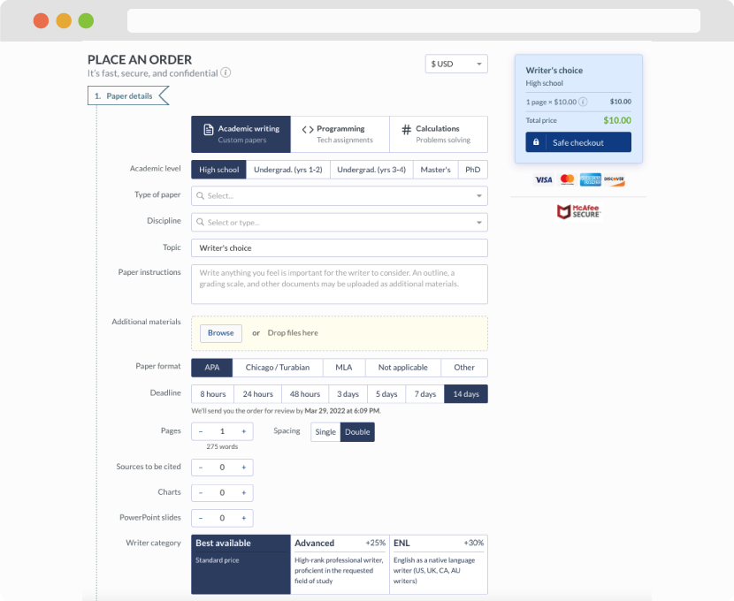
First, you will need to complete an order form. It's not difficult but, in case there is anything you find not to be clear, you may always call us so that we can guide you through it. On the order form, you will need to include some basic information concerning your order: subject, topic, number of pages, etc. We also encourage our clients to upload any relevant information or sources that will help.
Complete the order form
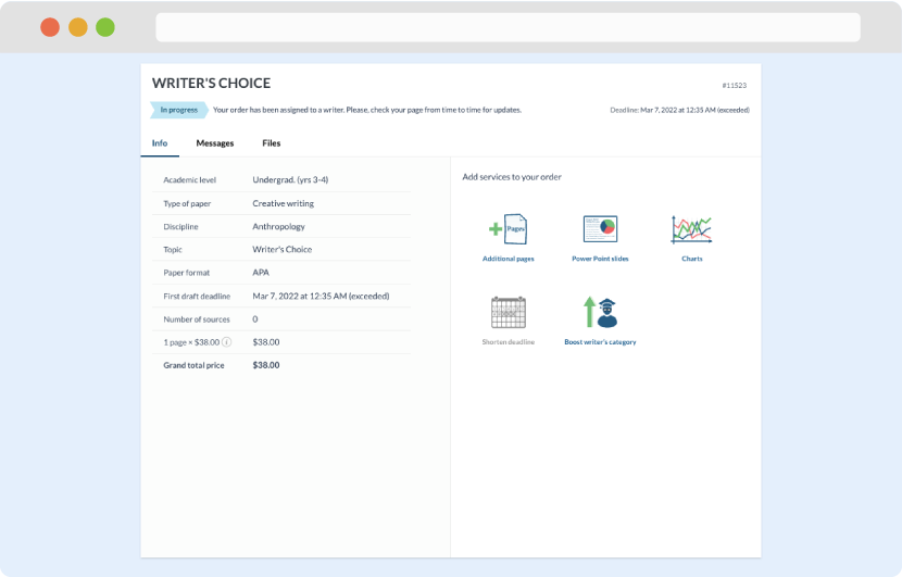
Once we have all the information and instructions that we need, we select the most suitable writer for your assignment. While everything seems to be clear, the writer, who has complete knowledge of the subject, may need clarification from you. It is at that point that you would receive a call or email from us.
Writer’s assignment
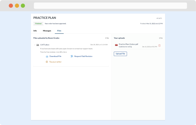
As soon as the writer has finished, it will be delivered both to the website and to your email address so that you will not miss it. If your deadline is close at hand, we will place a call to you to make sure that you receive the paper on time.
Completing the order and download