Website design is a key factor that influences usability of a website. Many web developers consider the aesthetics of web design and its role in user experience (Vu, 2011). Website visitors expect a simple website structure with clear navigation and proper organization of content. If a website fails to meet the design expectations of readers, it can adversely affect user experience and lead to loss of important web traffic which implies reducing declining revenue. An appealing web design incorporates Human Computer Interaction (HCI) principles which provide a robust framework for developing a usable website (Shneiderman, 2010). As web technology continues to evolve, web developers have to continuously focus on adopting emerging HCI principles to build unique and appealing websites that enhance user experience.
The purpose of this report is to assess the usability of the Jigsaw website store. The report emphasizes investigating interactive aspects and user interface design of the website. Through this report, we aim to determine key features of the website and identify various interaction and usability aspects of the interface. At the end of the report, we will have identified key web design issues that may be affecting the usability of the website and provided recommendations on how to resolve such issues to enhance user experience.
Jigsaw Store website is an ecommerce website that sells a variety of jigsaw puzzles online. The website displays various products sold as well as content related to the store including information about transactions, payment, etc. Buyers have to register in the site to purchase the product sold. Unregistered users are restricted to viewing products and reading pages providing information about the company. Users can view the items available, add them to cart, and complete the transaction by paying for the products via a range of payment options provided. Payment options available include PayPal, MasterCard, Visa, Money Order, Zip, Cheque, and direct Deposit. The products available are categorized into specific groups. A user can use the navigation options provided to view the products available in each category. A search bar is also provided to allow users to search for a particular product offered using keywords.
Jigsaw store website has a range of features that are aimed at enabling the site to easily navigate the site, learn about the company and products available, and facilitate transactions. The website is divided into three sections namely, header, content, and footer. The header section contains the navigation menu which consists of search bar, brand logo, and menu links. The links are placed on the top and the bottom part of the header section. Brand logo and search bar are centrally placed within the header. The content section displays the content relevant to each page. For example, in the homepage, the content section displays a slide show, featured products, description of the store, and featured brands that work with the store. This content varies from to page depending on the kind of information displayed.
The footer section is provides short cuts to various web pages providing information about the company’s operations, an email subscription feature, social links, logos of payment companies used by the company, and a copyright statement. Social links direct the visitor to the brand’s Facebook page and contact us page. The email subscription feature offered allows the user to subscribe to website updates by email. A user has to enter his/her email and submit. The shortcut links provided are essential in directing the user to web pages providing more information about the company and its operations. Additionally, the brand logos displayed are key in giving the company reputation as well as informing the user about the payment options available on the site.
When the user clicks the cart option on the header section, a window pops up and displays the items on cart. If the user has not added any item to the cart, a message is displayed to indicate the status of the cart. The header provides a search bar which allows users to search for specific keywords. The search bar is powered by Ajax as it supports live search. As the user enters characters of the keywords, a window pops showing results relevant to the keyword being entered. The lower menu has three dropdown links. When hovered, a list of links is displayed vertically. Users can click any of the link to visit a specific web page. For each product displayed on the page, cart option is provided. When user clicks this option, the item is added to the cart. In the search results page, results specific to the keywords entered are displayed on the content section. On the left side of the section, filter options are provided to refine the results provided. Users can filter the results by age, price range, brand, and categories. Two list options are provided at the top of the results page to allow users to adjust the length of each result returned. Additionally, a sort option is provided to allow users to sort the results by popularity, name, SKU, and price.
Positive aspects
Jigsaw Puzzle website has a simple UI design which reduces clutter on the page. The structure of the website is well organized with various web elements placed in appropriate places. Clutter in the navigation is reduced by creating two menus. The navigation is optimized for consistency which helps users to navigate the site easily. The menu is consistent with navigation standards which incorporate a logo to reinforce the brand and several links that serve as shortcuts to other web pages. The header incorporates a search bar and a phone number which are visible to users. This is key in encouraging users to take action. The menu options are well labeled and clearly inform user the functionality they support. The content section is well organized which makes the content displayed visible to the reader. The slideshow included in the homepage adds aesthetics to the page. Icons included in the homepage are well labeled which helps users to understand what kind of action they support. This assists in reducing confusion among new users on the site. The product slideshow included encourages users to interact with the site by scrolling the featured products presented.
The website has excelled in reducing congestion in the navigation by putting some links under several main links. For example, the theme links are classified under Puzzles by theme. Users have to hover over the main links to view the links grouped under them. The links provided reduce the number of clicks made to reach the target page which enhances navigation. The website also provides informative feedback to user to indicate changes. When a user adds items to the cart, the number of items in the cart and their price is indicated on the header.
Jigsaw Puzzle website also has several shortcomings that affect its usability. One key issue is the navigation which has too many links placed under one link. For example, over 20 links are grouped under the main link ‘Puzzles by Theme’. When a user hovers this link, the dropdown links extend beyond the screen and one has to scroll the page to see all these links. This affects usability and users may be confused when trying to identify the specific link that they need to click to get to the destination page.
The site lacks quick salient visual change which can help users to know the current state of the website. For example, when a user the option to add an item to cart, the website lags before displaying a modal indicating the status of the action. The website also lags before the reflecting changing the number of items in cart. When a user double clicks the option to add an item to cart, the website is unresponsive to this action. This may leave the users confused about the status of their action. The white space in the content section makes some pages appear less organized and is not appealing to users. Also, the footer section occupies a large space that should be reduced. The empty space between the copyright statement and the bottom border of the footer affects the aesthetics of the page.
Two of my friends also reviewed the site and provided their feedback on the usability of the site. One agreed with me that the Jigsaw Puzzle website has a simple UI design which is well structured. The other one concurred with me that the navigation menu had design issues due to the number of sub links contained in the main link ‘Puzzle by theme’.
To make the Jigsaw Puzzle website more usable to users, several changes have to be made to the UI design. The site navigation should be made more intuitive by reorganizing the links in the menu. The links under the main link ‘Puzzles by theme’ should be grouped into subcategories and be placed under the main link. The UI design should also be tweaked to provide salient feedback to the user indicating the status of an action. The white space in the website should be adjusted in some pages to make them look organized. While it assists to reduce clutter in some pages, it should adjusted to avoid a bright background in pages with less content. Additionally, the footer should be resized to reduce the empty space at the bottom. With these changes, the website can be more usable and appealing to users.
Conclusion
Jigsaw Puzzle website is an ecommerce platform with a simple UI design that aims at improving its ease of use for various users. The site has various features which allow users to perform various functions such as adding items to a cart, logging into the site, etc. These features are designed to enhance user experience. The usability of the website is influenced by the organization of the web elements and features in the web structure. The website hides some content to reduce clutter and displays key content that user needs to see. This increases the visibility of the website content to users. It is apparent that the design of the site incorporates some HCI design principles. However, the website also has some serious design issues which affect its ease of use. Too much clutter in the navigation design can have a negative impact on user experience as users are confused by the links available. As recommended, the site navigation should be changed by reorganizing the links and placing them in subcategories that are visible when the main link is hovered. Visual changes should be incorporated in the web design to ensure users receive feedback regarding the status of the system once an action is executed.
References
Shneiderman, B., 2010. Designing the user interface: strategies for effective human-computer interaction. Pearson Education India.
Vu, K.P.L. and Proctor, R.W. eds., 2011. Handbook of human factors in Web design. CRC Press.
Essay Writing Service Features
Our Experience
No matter how complex your assignment is, we can find the right professional for your specific task. Contact Essay is an essay writing company that hires only the smartest minds to help you with your projects. Our expertise allows us to provide students with high-quality academic writing, editing & proofreading services.
Free Features
Free revision policy
$10Free bibliography & reference
$8Free title page
$8Free formatting
$8How Our Essay Writing Service Works

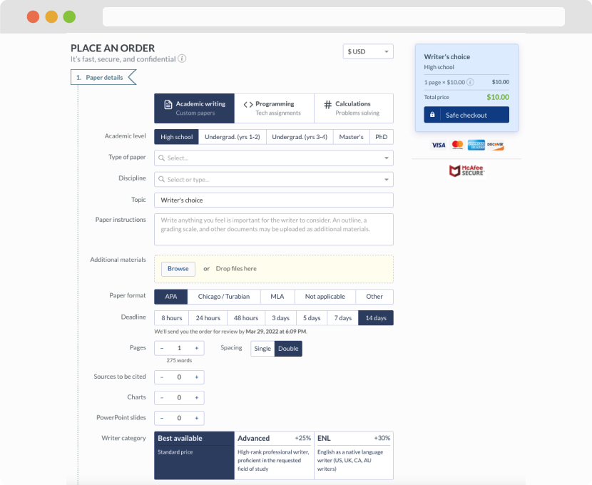
First, you will need to complete an order form. It's not difficult but, in case there is anything you find not to be clear, you may always call us so that we can guide you through it. On the order form, you will need to include some basic information concerning your order: subject, topic, number of pages, etc. We also encourage our clients to upload any relevant information or sources that will help.
Complete the order form
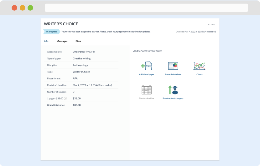
Once we have all the information and instructions that we need, we select the most suitable writer for your assignment. While everything seems to be clear, the writer, who has complete knowledge of the subject, may need clarification from you. It is at that point that you would receive a call or email from us.
Writer’s assignment
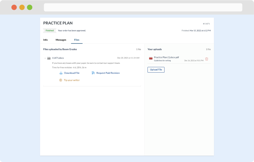
As soon as the writer has finished, it will be delivered both to the website and to your email address so that you will not miss it. If your deadline is close at hand, we will place a call to you to make sure that you receive the paper on time.
Completing the order and download