A website is a collection of Web pages, images, videos or other digital assets that is hosted on one or several Web server(s), usually accessible via the Internet, cell phone or a LAN. Web pages are HTML document accessible via Hyper Text Transfer Protocol (HTTP), protocol used for display of text and images in client browser. The web pages or pages of websites can typically be accessed from a common root Uniform Resource Locator (URL) called the homepage, which resides on the same physical server.
URL of pages are organized into hierarchies and accessed through hyperlinks or programmatic control.
(Anand, 2006) The website in this context is British Airways Website. Background Among the most successful companies in the United Kingdom is the British Airways. It commands the Airtime business in most parts of Europe and over the pacific. The main hubs of British airways are London Gatwick and London Heathrow. It also holds Type A Operating Licence from the United Kingdom Civil Aviation Authority and is operational in the context of mail, cargo and passengers.
It is also the founding member of the famous Oneworld airline alliance.
British Airways enjoys a fleet size of 230 and is operational with 75 countries with 147 flights. The headquarter of this company is located in London, England. Target Audience The primary Target audiences of the British Airways Site are the customers who are willing to use their services. The target audiences seem to be individual who are interested in getting details regarding holiday or business trip. The secondary target audience of the site is to lure companies with their portion of media and analysts, tertiary influencing climate of debate.
In other words its secondary target audience are the sections of the market that are interested in future investments in the company. The tertiary level of audiences is the stakeholders with the objective which includes shareholder who are obviously interested in check the details of the company. Searchability The searchability of a site includes general criteria, links to site, popularity, key term density, tagging and pings. In general criteria it is to see if the site has a distinct and recognisable purpose.
As evident from the index or home page, it is a site for marketing consultants or consultancy. The URL “http://ww. britishairways. com/” is also self explanatory. As the tag line suggests it goes for air travel, goodwill, services, strategies and plans for generating more business direct over the web. Links to within site is done along the sidebars which are cleverly done, as most of the terminologies used can easily be Google, Yahoo or Live searched like air travel, tour, British sites, flying, fly, holiday, flight, booking, hotel, booking, holiday plan, conducted tour, etc.
It is important see all these words qualify for most searched words in the world of travelling, which is their speciality. So it can be seen that purpose reinforced throughout the site. Even though it qualifies for Google Adwords Qualified Site, its searchability through popular search engines is questionable. It seems that key-terms are not submitted to sites like DMOZ, Yahoo or Google, or search engines do not give priority to the site in-front of others. Tagging done is meaningfully done.
Though one thing seems to be confusing look at the key word ‘Marketing Strategies’ is not used in side navigation bar. Similar mistakes have been done. This site popular it its circle, but it does not have a dedicated community of its own. But it is linked to a Blog site ‘http://cohn. wordpress. com/2007/05/20/search-britishairways. com/’, which is not popular either other than the owner of site ‘WordPress’ itself. The site is registered to Network Solutions, as per Whois. net. Notably, there is no in-site searches provided. Content
Customers or target audiences visit website for evidences of proficiency of the company, through proficiency of British Airway is undoubted, but website very few evidences are given of the products they are offering. Take example, link ‘Booking’. It shows a small preview of the details, with only a specific ‘booking reference’ and thus it becomes difficult to use the site as any interactive sources on net. The third criterion is content. Content here means it the content pacify the needs of the audiences and customers. Here as said earlier a brief preview of every front of travelling is given.
All the links are given in the side bar. If the links used were more categorised, like tree-view. Let us take an example, in the sidebar ‘manage my booking’ is given along with ‘executive class’. It would have been more convenient for Business client and travellers to find their needs at different categories rather than in same. So the flow of content is little indifferent and confusing. The site is helpful to give small write ups on all aspects of marketing, though seldom links go deeper than four levels. Also ‘key messages’ like “Under 12, travelling without someone 16 or over?
” has not been properly highlighted. Design It should be mentioned that the consistent logo is not available on every page of the British airways site. This is a feature that appears to be in sharp contrast to its competitors like Ryne air where the logo appears on every web page. The website design of British Airways is suitable for computer screens with 800 x 600 pixels. They have used a table designed but for forgot to make it middle aligned it, as it would have solved the problem. Though table design is used, but not on all pages the base table has been ‘centre aligned’.
The design of the website is inconsistent. There are navigation bars in the home and the booking page but there is none in the page where actual booking is placed. So after visiting this sub-page, for example, one has to use back button of browser to come to Home page or the booking page. Then again, not all pages have link bars as provided in Home page, so the look and feel is not consistent. The table design is used in most pages, and included the left side link bar and right side vote bar. But not all pages have so. Some pages, like the booking page (http://www.
britishairways. com/travel/home/public/en_gb? countrycode=GB), the advertisements come in middle of the webpage (like Hotels for 10 and Plan your Holiday) and the continuing content comes after it, which is ugly. (http://www. britishairways. com/travel/home/public/en_gb) Another peculiarity, in few pages it advertises ‘Company Information’ at the bottom page, though the direct relation is not visible and it is a usual convention to give name address of the parent company at the bottom page. However, here the link provider logo is given at the left bottom of the page.
Further more, the website seems to be doing everything though the links are only indicators of terms, a brief is given and at the bottom payment options given. Going by today’s website design one can say, it is to much straight forward with usual interactivity. Availability of tours and travel plans are also present. This also include flight booking and availability of flights and There are no shopping carts of its own nor is it linked to online shopping marts like EBay. Though, the website redirects to PayPal site for payments.
More so surprising as it vows by Web Marketing and offers various solutions. Interactivity It should be mentioned that there is no additional interactivity provided like direct hyperlink or well constructed message board. The website doesn’t seem to attract interactivity no visual use of animation or flash or even advertisement for its own product. There are no attempts to register customers. There is a link that offers email, fax and phone but in front page/home page it is not clearly understood. The link only is mentioned as ‘contact us’ in very small fonts and that too at the bottom of the site.
It should be noted that there is no existence of feedback forms at all and that evokes a feeling that the company is not at all interested in communicating with the potential client other than basic ticket book principals. Content Most interestingly there are only one navigation bar. There is also a site map available. All links are provided by side a bar which is well placed but fonts are smaller than normal text. Finding a topic becomes difficult as the sidebar has generated many features in one and however a good search engine is provided to search the site.
There is right side bar for booking information and it is reflected in all the subpages. This is usually not done for commercial sites. Since categorisation is not done it doesn’t help any particular group. The site usability is severely restricted for no usability of search engines. (Podolski, 2006) General overview To conclude, the British Airways company website has all the things that are provided in modern website but it is incapacitated by lack of additional interactivity. No special efforts have been taken to make clients or audiences to take interest in the website other than pure materialistic reasons.In other word though the site is useful it lacks proper sense of aesthetics.
References:
Anand, V; (2006); The Process of Thought and Perception in Economics; Auckland: HDT Ltd. British Airways; (2007); Publication; britishairways. com; retrieved on 27. 02. 2008 from http://www. britishairways. com/travel/home/public/en_gb Podolski, V; (2006); Public Perception of Perceptions: An Approach towards Economic Intelligence; Dunedin: IBL & Alliance Ltd Roberts, O M; (2005); Outline of Global Economy; Wellington: National Book Trust Virtual pet; (2007); Home; virtualpet. com; retrieved on 27. 02. 2008 from
Essay Writing Service Features
Our Experience
No matter how complex your assignment is, we can find the right professional for your specific task. Contact Essay is an essay writing company that hires only the smartest minds to help you with your projects. Our expertise allows us to provide students with high-quality academic writing, editing & proofreading services.
Free Features
Free revision policy
$10Free bibliography & reference
$8Free title page
$8Free formatting
$8How Our Essay Writing Service Works

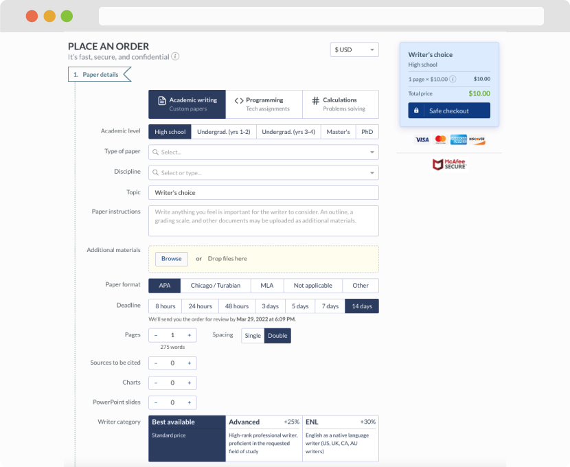
First, you will need to complete an order form. It's not difficult but, in case there is anything you find not to be clear, you may always call us so that we can guide you through it. On the order form, you will need to include some basic information concerning your order: subject, topic, number of pages, etc. We also encourage our clients to upload any relevant information or sources that will help.
Complete the order form
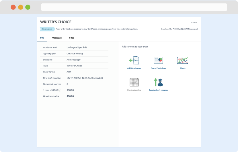
Once we have all the information and instructions that we need, we select the most suitable writer for your assignment. While everything seems to be clear, the writer, who has complete knowledge of the subject, may need clarification from you. It is at that point that you would receive a call or email from us.
Writer’s assignment
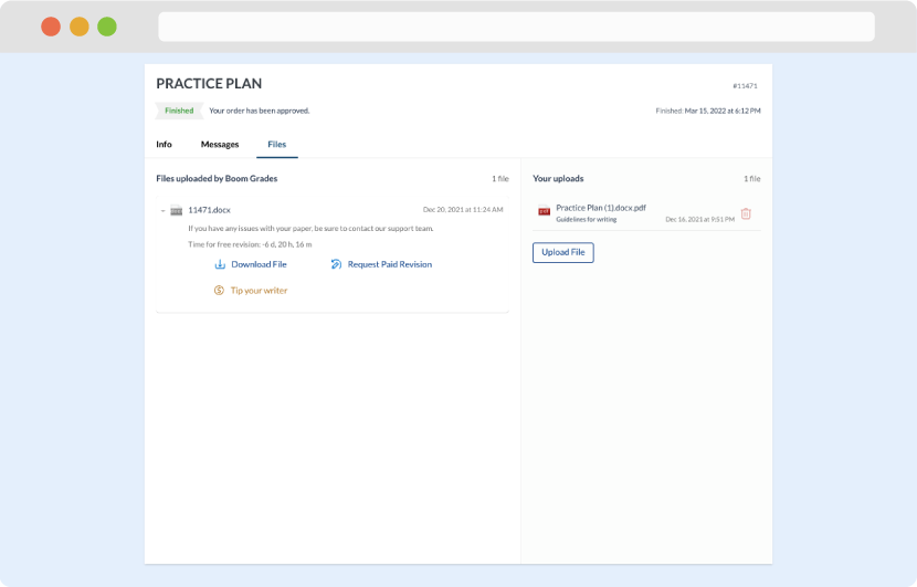
As soon as the writer has finished, it will be delivered both to the website and to your email address so that you will not miss it. If your deadline is close at hand, we will place a call to you to make sure that you receive the paper on time.
Completing the order and download