Question:
Write a report about the evaluation of information technology in respect to the objectives and effectiveness, features and accessibility of the websites along with the usability principles in context to Human Computer Interaction.
The following report presents the differential evaluation of two nominated websites 1: https://www.binglee.com.au and 2: https://www.kogan.com/au/ based on different aspects of information system in context to different factors like user interface design of the website, its accessibility, homepage pretest, web graphics, use of colours etc. The objective of presenting the critical evaluation of the two websites is whether the websites serving the purpose, accuracy, coverage of the respective products and other similar factors.
The nominated websites, Binglee and Kogan both are electronic stores located in Australia serves e-commerce service. The organizations are largely into the trading of electronic appliances of different variety as an online shopping option. For this purpose both the organizations have their own set and design of websites which helps to attract customers and easier way to find the products as per their requirement (Brown & Gilchrist, 2016).
Website of Binglee presents different tabs for its products according to the variety of the electronic appliances like computers, cameras, home appliances, small or medium size appliances, fitness/ health etc. Just below these tabs it presents a promoting tab which reflects different offers to attract buyers like products offering on discounts, tie in arrangements of products or any other promotional offer to take the clients attention. The website also presents option for catalogues, store location (for clients if they want to choose the products physically), other small or regular promotional offers followed by trending or new launched products along with the options for registration and log in facilities so that the details and information of the customers can be maintained in records (Cook, et al. 2015).
On the other hand, website of Kogan presents its website for the products according to the department, which further segregates the appliances in different variety, according to brand of the appliances. The website further follows a small tab presenting the promotional offer in terms of bargains and discount options. The website additionally provides different tabs for the different class of appliances like LED TVs, Cellular phones, home appliances in terms of both brand and types of appliances.
For any business websites there are certain important and vital features that every enterprise has to maintain in order to operate its online business successfully (Hashim, 2015). Hence, the evaluation in regard to the key features for both the business websites, Binglee and Kogan are mentioned below:
Moreover, apart from the aforementioned features, a business website has to eye catchy and attractive in terms to provide a good impression especially for the first time users. Use of colours, designs, encryption of data, segregation of product types etc should be in proper content so that the website becomes user friendly (Cook, et al. 2015).
In case of nominated website Binglee.com the homepage seems o be quite attractive as the colours and designs used in the website are brighter and eye catchy. The giant tab reflecting different promotional offers has been designed in different colours and designsto make it more flashy and attractive. One section of the tab is designed in the red colours and balloons to flash the sale season for the users while the other tab is designed in blue and white bright colour combination to promote the tie in arrangement of products. The tab has been designed in such a way that any user will get attracted and goes through the information and details even if the user was not intended to. The other tabs of the website reflecting different types of appliances and gadgets are designed in light blue colour which is again quite attractive as it’s a bright colour and more eye catchy (Xiang, Magnini, & Fesenmaier, 2015).
Apparently, in case of the second nominated website Kogan.com the design and colours of home page is very simple compared to the first nominated website. In this website, the designer has used pastel colours for the tabs flashing department of products and brand names while the encrypted names in simple black colour, which seems little less attractive. The website further provides different tabs of its products as per the department types and brand types flashing the picture and names of the products. In comparison to the first website it does not reflect the page very attractive instead it looks pretty dull as the colours used in the pictures also are not brighter colours. Hence, even if the company privides products in simpler and user-friendly manner, it might lack in attracting new or proposed clients (Brown & Gilchrist, 2016).
Further, on proceeding to the particular products on each of the nominated website, it seems that Binglee is still one-step ahead. On licking the particular product on Binglee.com it flashes that particular product in a bigger picture along with the relevant information and details. Whereas in case of Kogan.com it reflects different options and varieties of that particular product with a smaller, picture and details. We can say that the organization is providing detailed information and variety of products but it is quite a longer process for users’ point of view. In the present conditions, users are more time saving seeker rather than any other factor hence it is not attracting users to click and choose for a particular product repeatedly (Brown & Gilchrist, 2016). It can also be stated that the website of Binglee company is more concise and structured compared to Kogan company.
HCI refers to the findings of human computer interaction and guidance on its usage in order to create and design a website. In the study of Information System, there are certain principles regulating human computer interaction on its usage and utility (Cook, et al. 2015). Hence, both the nominated websites, Binglee and Kogan are required to maintain and comply the principles laid in terms of HCI in information technology system.
Learnability Principle: Any organization opting for online business has to comply with the learnability principle against Human computer interaction principles (Cook, et al. 2015). It states that the website operation should provide ease of accessibility so that there can be effective and significant interaction and maximum level of performance especially to the new users.
In context to the above-mentioned explanation nominated website Binglee.com and Kogan.com the hosts have complied with the learnability principle as they provide user-friendly accessibility. Even if the user is new it will not be difficult to operate these websites. However, on comparing the two websites it can be said that Kogan.com is little more structured for new users as it provides tabs for its products presenting via bigger design and image of products. While in case of Binglee.com this clarity is little less in terms of products feature.
Flexibility Principle: This principle states that there should flexibility in the ways of accessing the websites between users to exchange information (Cook, et al. 2015). In case of Binglee.com and Kogan.com this feature is in compliance as both the websites places the flexibility for using the respective websites in multiple ways.
Robustness Principle: This is an important principle to be followed and complied by all the business websites. It states that the there should be adequate and appropriate support for the recovery of information to the users in order to determine and accomplish successful achievement. In case of nominated websites Binglee and Kogan, it is very important for the Information Technology system team to provide and maintain this principle. There should be proper and appropriate support for recovery between the users and information system (Brown & Gilchrist, 2016).
On analyzing the surveys and principles in relation to the websites of Binglee and Kogan the required recommendation has been provided. As it is mentioned earlier that the kogan website is little dull in attracting the users in terms of its colours used in the tabs whereas Binglee.com is more attractive. Hence, Kongan entity is recommended to change its color combination to make its home page little more eye catchy. Additionally, the Kogan website is recommended to change its homepage design as well to present its product in more structured way i.e. different types of appliances divided according to its usage in one side. While as per brand names on the other side as well as the locations of the stores and directions and maps so that it becomes more user friendly (Brown & Gilchrist, 2016). Whereas the website of Binglee.com is recommended to provide little more varieties and details on its each product range so that the clients get different varieties and hence prospect clients are expected to join in.
Conclusion:
The above report dealt with the evaluation of information technology in respect to the objectives and effectiveness, features and accessibility of the websites along with the usability principles in context to Human Computer Interaction. The evaluation has been reported for two nominated websites Binglee and Kogan, both dealing in electronic appliances through e-commerce. The report has been presented on analysis of various aspects like attractive home page, user-friendly accessibility, designing, support for recovery etc. Upon analyzing these aspects, a section on recommendation to improve the respective websites has also been mentioned in the solution.
Reference List:
Bilbao-Osorio, B., Dutta, S., & Lanvin, B. (2013). The global information technology report 2013.
Brown, W. L., & Gilchrist, W. J. (2016). Assessing productivity to address safety concerns for information technology and promoting global standardization within aviation practices. Global Journal of Information Technology, 5(2), 56-61.
Cook, D. A., Sorensen, K. J., Nishimura, R. A., Ommen, S. R., & Lloyd, F. J. (2015). A comprehensive information technology system to support physician learning at the point of care. Academic Medicine, 90(1), 33-39.
Hashim, J. (2015). Information communication technology (ICT) adoption among SME owners in Malaysia. International Journal of Business and Information, 2(2).
Le Bourgeois, T., Thompson, D. I., Guezou, A., Foxcroft, L. C., Grard, P., Taylor, R. W., … & Carrara, A. (2016). Using information technology, communication and citizen science in alien invasive plant management in Kruger National Park, South Africa. Botanists of the twenty-first century: roles, challenges and opportunities: Quels botanistes pour le 21e siècle? Métiers, enjeux et opportunités, 103.
Lee, A. S., Thomas, M., & Baskerville, R. L. (2015). Going back to basics in design science: from the information technology artifact to the information systems artifact. Information Systems Journal, 25(1), 5-21.
Lioukas, C. S., Reuer, J. J., & Zollo, M. (2016). Effects of Information Technology Capabilities on Strategic Alliances: Implications for the Resourceâ€ÂBased View. Journal of Management Studies.
Lohrke, F. T., Frownfelter-Lohrke, C., & Ketchen, D. J. (2016). The role of information technology systems in the performance of mergers and acquisitions. Business Horizons, 59(1), 7-12.
Melián-González, S., & Bulchand-Gidumal, J. (2016). A model that connects information technology and hotel performance. Tourism Management, 53, 30-37.
Morgan, T. R., & Richey, R. G. (2016). Developing a Returns Competency: The Influence of Collaboration and Information Technology. In Let’s Get Engaged! Crossing the Threshold of Marketing’s Engagement Era (pp. 399-400). Springer International Publishing.
Rivard, S., & Aubert, B. A. (2015). Information technology outsourcing. Routledge.
Schnoll, H. J. (2015). E-government: Information, technology, and transformation. Routledge.
Schwalbe, K. (2015). Information technology project management. Cengage Learning.
Star, S. L. (2016). 6 Misplaced Concretism and Concrete Situations: Feminism, Method, and Information Technology. Boundary Objects and Beyond: Working with Leigh Star, 143.
Venkatesh, V., Thong, J. Y., & Xu, X. (2012). Consumer acceptance and use of information technology: extending the unified theory of acceptance and use of technology. MIS quarterly, 36(1), 157-178.
Xiang, Z., Magnini, V. P., & Fesenmaier, D. R. (2015). Information technology and consumer behavior in travel and tourism: Insights from travel planning using the internet. Journal of Retailing and Consumer Services, 22, 244-249.
Essay Writing Service Features
Our Experience
No matter how complex your assignment is, we can find the right professional for your specific task. Contact Essay is an essay writing company that hires only the smartest minds to help you with your projects. Our expertise allows us to provide students with high-quality academic writing, editing & proofreading services.
Free Features
Free revision policy
$10Free bibliography & reference
$8Free title page
$8Free formatting
$8How Our Essay Writing Service Works

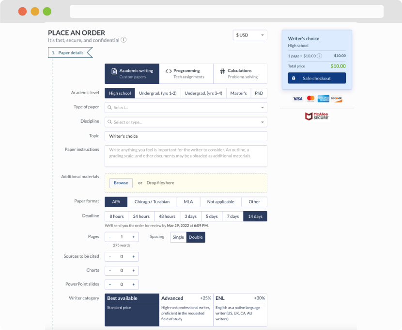
First, you will need to complete an order form. It's not difficult but, in case there is anything you find not to be clear, you may always call us so that we can guide you through it. On the order form, you will need to include some basic information concerning your order: subject, topic, number of pages, etc. We also encourage our clients to upload any relevant information or sources that will help.
Complete the order form
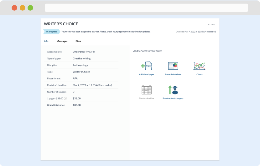
Once we have all the information and instructions that we need, we select the most suitable writer for your assignment. While everything seems to be clear, the writer, who has complete knowledge of the subject, may need clarification from you. It is at that point that you would receive a call or email from us.
Writer’s assignment
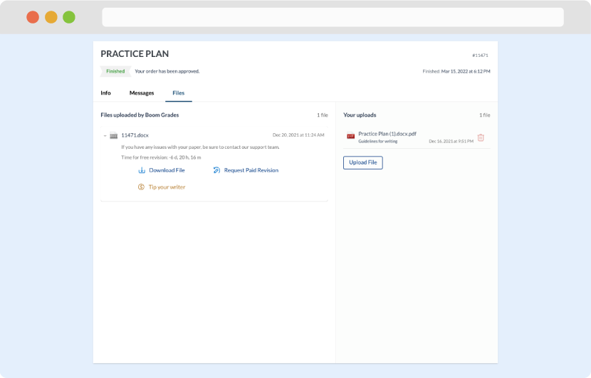
As soon as the writer has finished, it will be delivered both to the website and to your email address so that you will not miss it. If your deadline is close at hand, we will place a call to you to make sure that you receive the paper on time.
Completing the order and download