Responsive web design is the methodology of designing and developing websites to respond dynamically and normally to users’ environment and behavior based on platform, screen size, and orientation (Turan and ?ahin, 2017, p. 114). This is a very important factor in today’s web design because today website users want a website that allows them to access it using different devices such as mobile, table, or a desktop while maintaining the look and feel across all the devices and platforms (Ratcliffe, 2015, p. 356). This report seeks to outline the various aspect that were considered in developing a responsive website.
Colors that makes up the website matter a lot and is one of the most critical elements in the design process. Most of the time this factor is overlooked but is the choice of appropriate color that makes a successful website (Anthes, 2012, p. 16). Knowing the target audience will determine the type of colors to be used. the website being developed is an art gallery website and in art, colors speak. As such, the colors used in the development of the responsive website creates a positive effect on the visitors and makes them interact with the website much longer. Here is the list of the things considered vital in determining the colors that were used in building the website:
Background color: the background color chosen for the website is white. This punched the website page forward and maintained the concentration of on the pages. An image banner was used as a background image for the menu. The choice of the image focused on ensuring that it conveys a message about the website itself and is in line with what the website is all about.
Text Color: the choice of the colors is important so as to ensure that it is relevant to the industry. The primary colors used across the website are green, blue, website itself (Guidang, 2016). The white background color has been maintained across all theblack and white. White was used on the menu, black was used on the paragraphs because it is clearer and more readable, green being pleasing to the eye was used as image names, and blue used as header sections title. Using many colors in a website (rainbow design) is discouraged and thus 3-4 colors were used (Carver, 2015).
Image properties: The overall image tag that was used across all images is as shown in the code below-
<img data-src=”Image_URL” alt=”image_name” /></div>
Links: on the navigation menu, the hover effect has been used to ensure that when the visitors moves the mouse pointer over the menu option its highlighted green. Additionally, all the visited links will be highlighted blue which is a standard acceptable color for visited links (Baturay and Birtane, 2013, p. 2277).
Aligning text elements properly in a website greatly affects the overall design and outlook. Aligning elements like texts and images meticulously makes the website to look more visually appealing and professional (Walker-Headon, 2016, p. 271). The text elements maintain readability which is an important concern for the visitors. The figure below shows text alignment of the operational hours:
Having contact form on the website is very essential because it allow your visitors to get in touch with you and seek clarifications, leave complements, and suggestions. It gives the visitors a simple way to communicate with you through the website (Sutton, 2018, p. 6). Contact form can also be used to effectively engage with the visitors. The figure below shows the contact form:
Respondent 1 was asked to review the index.html page and give the opinions on the overall layout of the contents of the page. The respondent accessed the page from 15-inch laptop. Having given the respondent with the initial requirements to countercheck if every aspect had been captured, the respondent said that the overall design of the website was okay. Respondent 1 further stated that it would have been more attractive and appealing if a slide show of the images was added to the home page. In his concluding comments, the respondent was impressed with the overall functionality because all the links were working from the home page and directs to the correct page. On a scale of 1 to 5 (5 being the best), respondent 1 rated the index.html page at 4.
Respondent 2 tested on art_diary.html, artist_trading_cards.html, and papper_struture.html. The essence of this test was to test on the images were displayed. Respondent 2 was satisfied with how the images were aligned and displayed. The respondent suggested that it would have been more appealing if all the images were of the same size rather than having images of different sizes which affects the overall layout of the images. The respondent gave an example of one image in the art-diary.html which was smaller that the rest. On a scale of 1 to 5, respondent 2 rated the art-diary at 3 (with emphasis on ensuring all the images are of similar sizes) and rated 5 both artist-trading-cards.html and paper-struture.html.
Respondent 3 was asked to review the business-hours.html page. The respondent said that the position of the logo, menu, and footer were okay but the layout of the business hours was not appealing. She said that the content looked irrelevant because no emphasis was put on the content. The font used was small and the alignment made it to look like it is not important information to read. The respondent recommended that it would been more appealing if the font was increase, and the content tabulated and centered on the page. On a scale of 1 to 5, respondent 3 rated the business-hours.html page at 3.5.
Respondent 4 was asked to review the about.html page. the respondent said that the overall layout was fine but could be improved by aligning the image and the text to be on the same level and not the image being larger that the text content. Respondent 4 rated the about.html at 4/5.
Respondent 5 reviewed the contact.html page. The respondent said the was very appealing with the contact form be clear and straight forward. However, respondent 5 did not give any recommendations or any suggestions. He rated the page at 5/5.
Based on their feedback it can be concluded that the website is responsive, appealing, and website content properties were maintained on the various screens. Additionally, some recommendations like using images of the same size is very good but cannot be implemented because resizing the images could affect the quality and look. Using slideshows on the home page is a nice idea but out of scope. Tabulating and increasing the font size of business-hours.html content is possible and this can be done.
The assumptions made is the will use mouse, keyboard, and touch screens to interact with the website and no other input will be used. secondly, the visitors will have high-speed internet to ensure that the website loads faster. The users confirmed these assumptions because they had good internet and only used mouse, keyboard, and touch as the primary input.
The key objective of the portfolio is to develop and test a responsive website that can adjust normally to various screen sizes. In portfolio 2.1 design sketches were used to create wireframe mockups for the different web pages to adopt flexible design. Portfolio 2.2 described the various graphics options and how to use them in designing the website. It requires testing of image properties on different browsers to ensure that they display correctly. The requirements of portfolio 2.3 were to examine the external and internal navigation requirements and redesigning the flowchart to meet these requirements. Text alignment and clarity were tested in portfolio 2.5. This is an important property in ensuring that the visitors can read and interpret the text content on the web page. Portfolio 2.6 put the website on test to check if the responsive properties of the website have been met. Visitors were allowed to test the website on different screen sizes to test on the design, outlook, and responsiveness of the website.
Conclusion
When developing a website, the major focus will be on the users of the website or target audience. The overall look and feel of a website matter and will determine the overall acceptance by the users. If visitors find the website more appealing and attractive, they tend to spend more time interacting with the website. Therefore, it is essential to ensure that when developing a website, it is important to use flexible layouts and grids, CSS media queries, and images so as to enable users to switch from a desktop to a mobile or tablet environment while maintaining the look and feel of the website. The website contents should also adjust normally and dynamically to fit the different screen sizes. Also, the website should not block the users from accessing the various web pages and respond automatically to the preferences of the visitors. This would eliminate the need of developing and designing the layouts for every device available.
Reference List
Anthes, G. (2012). HTML5 leads a web revolution. Communications of the ACM, 55(7), p.16.
Baturay, M. and Birtane, M. (2013). Responsive Web Design: A New Type of Design for Web-based Instructional Content. Procedia – Social and Behavioral Sciences, 106, pp.2275-2279.
Carver, M. (2015). The responsive web. Shelter Island, N.Y.: Manning.
Dukes, W. (2013). The modern Web: multi-device Web development with HTML5, CSS3, and JavaScript. Choice Reviews Online, 51(02), pp.51-79.
Filippova, L. and Svidelskyi, R. (2016). Research of key approaches to responsive website development and their practical application. Technology audit and production reserves, 6(1(32), pp.31-35.
Guidang, E. (2016). A Responsive Website: Development and Traffic Analysis. JPAIR Multidisciplinary Research, 26(1).
Natda, K. (2013). Responsive Web Design. Eduvantage, 1(1).
Ratcliffe, J. (2015). Making your brand mobile-friendly by creating a website with a responsive design. Journal of Aesthetic Nursing, 4(7), pp.356-357.
Rodzvilla, J. (2012). A Review of “HTML5 and CSS3: Develop with Tomorrow’s Standards Today.”. Journal of Web Librarianship, 6(1), pp.78-79.
Sutton, H. (2018). Customize the adult learner experience with responsive website design. Recruiting & Retaining Adult Learners, 20(8), pp.6-7.
Turan, B. and ?ahin, K. (2017). Responsive Web Design And Comparative Analysis Of Development Frameworks. The Turkish Online Journal Of Design, Art And Communication, 7(1), Pp.110-121.
Walker-Headon, N. (2016). Responsive Web Site Development at the Library, Institute of Technology Tallaght: A Case Study. Journal of Web Librarianship, 10(4), pp.267-293.
Essay Writing Service Features
Our Experience
No matter how complex your assignment is, we can find the right professional for your specific task. Contact Essay is an essay writing company that hires only the smartest minds to help you with your projects. Our expertise allows us to provide students with high-quality academic writing, editing & proofreading services.
Free Features
Free revision policy
$10Free bibliography & reference
$8Free title page
$8Free formatting
$8How Our Essay Writing Service Works

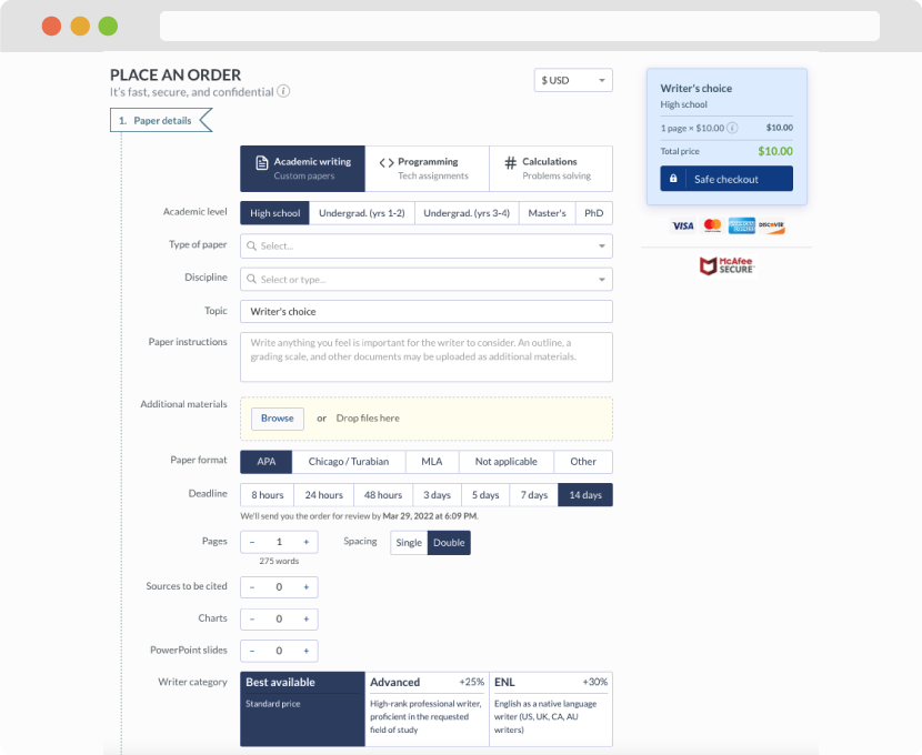
First, you will need to complete an order form. It's not difficult but, in case there is anything you find not to be clear, you may always call us so that we can guide you through it. On the order form, you will need to include some basic information concerning your order: subject, topic, number of pages, etc. We also encourage our clients to upload any relevant information or sources that will help.
Complete the order form
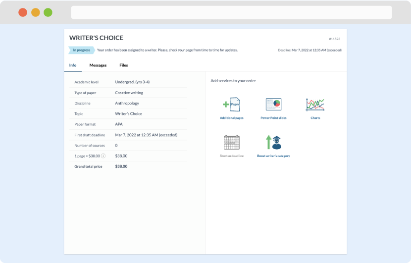
Once we have all the information and instructions that we need, we select the most suitable writer for your assignment. While everything seems to be clear, the writer, who has complete knowledge of the subject, may need clarification from you. It is at that point that you would receive a call or email from us.
Writer’s assignment
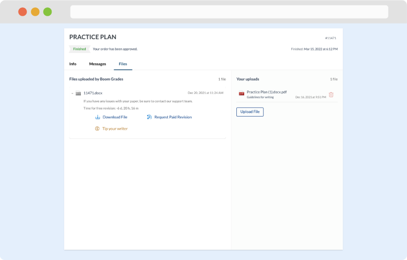
As soon as the writer has finished, it will be delivered both to the website and to your email address so that you will not miss it. If your deadline is close at hand, we will place a call to you to make sure that you receive the paper on time.
Completing the order and download