https://www.newsweek.com/ is an online news provider providing its readers with news articles. The website has been optimized for desktop view devices, medium display devices and other small devices like smartphones. This report aims at providing an analysis of the design of the website across a range of different screen sizes to show how the design accomplishes its purpose for the website. The evaluation is done using Google’s device simulator to simulate the appearance of the website across a range of different screens with different screen resolutions. The analysis done helps to come up with a recommendation on how the website’s design can be improved to accomplish more out of its design.
The simulation tool used does not guarantee that the website would appear exactly as shown in this paper as different devices have different hardware capabilities which the device simulator does not possess.
2. Discussion
https://www.newsweek.com/ is an online news agency delivering news through the online platform instead of the old print media. Newsweek has different versions of the website depending on the location and language of the reader. For example, readers in the US can read stories relevant to US. The website delivers the news as articles with each article with images and content. The website has video news where by users can get news content by watching a video in the website.
2.1 Features of the website
The feature of the website can be discussed based on the structure of the website. The website has three main components forming up its structure. These components are;
The header consists of the logo of the website and the navigation of the website. The header tab has a fixed property to ensure that it does not disappear when the user scrolls down or backup. The header strip stays at a fixed position no matter where the user is on the website. The navigation has different components that the enable the user to surf through different pages of the website. These navigation components are;
The components of the menu can be used to show the different section of the website and what every section has in terms of content.
Every page has a body and different pages have a different structure of the body container. In most pages, the body section contains the content of that page. The section is subdivided into many subsections. For example, in the homepage, the body has a main story section which is captioned by a large image and alongside it is a column containing the headlines. The sub-section that follows contains a preview of different articles from where the user can press to be redirected to the main article. Alongside this sub-section, there is an advertisement column where ads run.
The final section in every page is the footer. The footer is customized to give information about the Newsweek company. The footer has a column which has links like about us which give information about Newsweek. Other links include contact us, careers, privacy policy, copyright and terms of sales among a few others. All these links are mostly relevant to Newsweek as a company. The other subsection of the footer previews different versions of newsletters published by Newsweek with an option of subscribing for the Newsweek.
According to the structure of the website its clear the website is organized into a header, body and footer with the header and footer remaining unchanged in all the pages while the content of the body changes through various pages depending on the category of the content.
2.2 Website evaluation
For the design and responsiveness of the website, the following factors can be considered to show whether the design of the website achieves its objectives while at same time delivering the best responsive design to give every user a rich user experience. These factors are;
2.2.1 Usability
Usability is a very important aspect to consider when designing a good responsive design. A good website should be easy to use using any device. A design is good if every user using the website will have an easy going through all the pages of the website (Warren, 2010). All components should be easy to locate and access. For example, when using devices with smaller screen sizes, the website should able to position all the elements making it easy for the user to use the website.
2.2.2 Navigation
Navigation is a crucial part of a website especially a website like Newsweek which has many pages due to its wide range of content. Navigation should be designed properly to make it easy for the user to switch through different sections of the website. The navigation should respond in an optimized manner based on the device being used by the user.
2.2.3 Communication
In most cases, users don’t want to spend a lot of time to look for something interesting. Most users want to access a website and within few minutes of going through the different types of content the users want to have found something to read (Strickler, 2016). This can all be achieved by using a good pattern to design the website. The pattern should be designed to respond in a unique manner based on the device that the user is using.
2.2.4 Fonts and font sizes
For a website like Newsweek, the font and font sizes is a crucial factor to consider when designing the website. This is because such websites are meant for readers and thus the best font for reading on devices should be used. The font size should not be too small that the user strains while reading the content and also the size of the font should not be too large bringing about a cluttering look in the design (Singh, 2015). The colors used as background should be chosen in consideration with the color of the font or simply, the font color should be chosen the color of the design in the background.
2.2.5 Times taken to load pages
The time it takes to load a page is a very important aspect to consider while designing a responsive website. Page should be designed in a such a way that it does not take a lot of time to load as the user can be switching between many pages and if the load time is fairly huge, then the user might get bored (Laja, 2012).
2.2.1 Purpose
Finally, the purpose of the website should be considered while designing a responsive website. The purpose of the website should act as a guide for the designers. For example, for a website like Newsweek the simplicity in the design is crucial as the website should look professional in order to achieve its purpose (Cao, 2015).
Based on the following factors the website can be evaluated through three types of displays.
For every display, two screen resolutions are analyzed.
2.3 Large display
Large display is mostly for devices ranging from Desktop PCs, notebooks and televisions with the capability of opening webpages. A good example of televisions that can open web pages are Android televisions. These devices have a resolution greater than 1280x 760 pixels.
Using Google’s device simulator, the following resolutions are analyzed.
1366 x768 pixels- This display is typical for desktops and notebooks
1920 x 1080 pixels- This screen size is typical for TVs with the capability of opening web pages.
Considering the two resolutions, the design of the website can be scrutinized based on the following factors to see whether the interactive and designs goals relating to responsiveness of the overall website have been achieved.
Medium display devices are devices with a resolution ranging from 480 x 640 pixels to 700 x 960 pixels. These devices are mostly tablets and iPads although the advancing technology has enable some tablet devices to support a much higher resolution. To analyze the behavior of the website on medium display devices, the following resolution is evaluated.
480 x 640 pixels
For medium devices, the design is analyzed in both portrait and landscape and orientation.
Portrait orientation
Considering the two resolutions, the design of the website can be scrutinized based on the following factors to see whether the interactive and designs goals relating to responsiveness of the overall website have been achieved.
This display has a screen resolution ranging from 200 x 320 pixels to 400 x 640 pixels. Devices with this screen size are usually small hand-held smartphone devices.
To evaluate the appearance of the website in tiny displays, the following resolution is considered;
360 x 640 pixels
This screen resolution is common in many mobile devices for example Samsung Galaxy S5. Evaluation is done for both portrait and landscape orientation
Portrait orientation
Considering the two resolutions, the design of the website can be scrutinized based on the following factors to see whether the interactive and designs goals relating to responsiveness of the overall website have been achieved.
Based on the analysis of the different evaluations shown in the discussion, Newsweek is making most of its design to create a responsive website which gives a rich user experience to the readers as the user interaction is considered for all devices. One such positive aspect of the design is the navigation of the website. The navigation has been designed to respond and adapt across any screen size with any resolution. This is a very big plus. This is facilitated by the fact that the navigation bar stays in a fixed position so the menu does not disappear when the user is scrolling up or down.
Apart from the many positives in the design a few negatives can be pointed out and recommended for consideration by Newsweek. One such issue is the number of articles appearing in a single page. For devices with smaller screen sizes, the number of articles appearing in a single page should be small and then employ the concept of pagination to classify the articles in pages. This will make it easy for the readers to find something interesting as the website communicates easily in this way rather than when there are many articles in a page. If users are able to find interesting things to read then the website achieves its purpose.
Simulation of the website has been made possible by use of Google’s device simulator. These kinds of tools have advantages and disadvantages.
3.1 advantages of developer tools
Developer tools can be very useful to developers because they provide a platform of testing of the website before its deployed. The testing is done across a simulation of many devices with different screen resolutions. This testing process ensure that the design released is the best to use across all devices.
3.2 disadvantages of developer tools
Developer tools can be used by malicious users to tweak the design and appearance of the website. Although the tweaked appearance appears only on the browser of the malicious users, they can distribute negative appearances thus destroying reputation of the website to make the original designers look incompetent.
4. Conclusion
According to the evaluation done for Newsweek, the website can be seen to be emulating all the good aspects of a good design to give a rich user experience to the users but they are few aspects that should be improved to make the website even better. These findings are made possible by existence of developer tools like Google device simulator.
5. References
Anon, Material motion. MOTION. Available at: https://material.io/guidelines/motion/material-motion.html# [Accessed May 10, 2017].
Cao, J., 2015. 7 tips to create awesome mobile app designs. TNW. Available at: https://thenextweb.com/dd/2015/07/01/7-tips-to-create-awesome-mobile-app-designs/#.tnw_5HyLNXYm [Accessed May 10, 2017].
Laja, P., 2012. 8 Effective Web Design Principles You Should Know. CXL. Available at: https://conversionxl.com/8-universal-web-design-principles-you-should-to-know/ [Accessed May 9, 2017].
Singh, M., 2015. Pretty App you got there – But is it comfortable to use? KAYS HARBOR TECHNOLOGIES. Available at: https://kaysharbor.com/blog/mobile/pretty-app-you-got-there-but-is-it-comfortable-to-use [Accessed May 10, 2017].
Strickler, K., 2016. WHAT MAKES A GREAT WEBSITE? 10 WEBSITE TRENDS FOR 2016. Common places. Available at: https://www.commonplaces.com/blog/10-website-trends-for-2016 [Accessed May 9, 2017].
Warren, C., 2010. 5 Things to Consider When Designing Your Mobile App. Mashable. Available at: https://mashable.com/2010/07/07/designing-mobile-apps/#4wXGwx6sIkq6 [Accessed May 10, 2017].
Essay Writing Service Features
Our Experience
No matter how complex your assignment is, we can find the right professional for your specific task. Contact Essay is an essay writing company that hires only the smartest minds to help you with your projects. Our expertise allows us to provide students with high-quality academic writing, editing & proofreading services.
Free Features
Free revision policy
$10Free bibliography & reference
$8Free title page
$8Free formatting
$8How Our Essay Writing Service Works

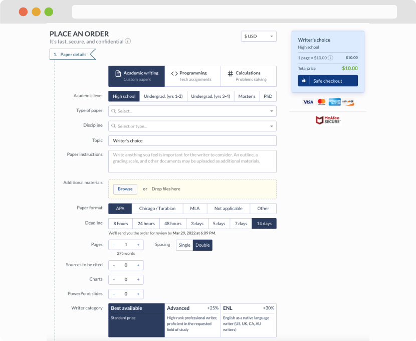
First, you will need to complete an order form. It's not difficult but, in case there is anything you find not to be clear, you may always call us so that we can guide you through it. On the order form, you will need to include some basic information concerning your order: subject, topic, number of pages, etc. We also encourage our clients to upload any relevant information or sources that will help.
Complete the order form
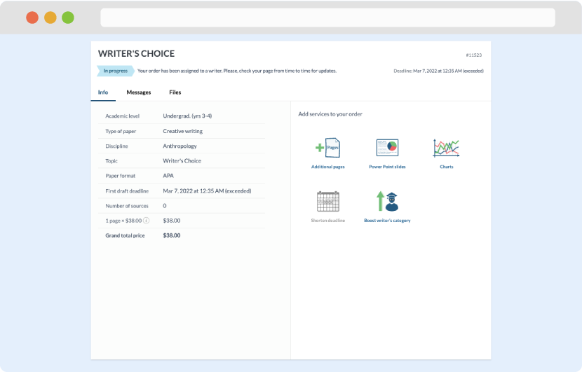
Once we have all the information and instructions that we need, we select the most suitable writer for your assignment. While everything seems to be clear, the writer, who has complete knowledge of the subject, may need clarification from you. It is at that point that you would receive a call or email from us.
Writer’s assignment
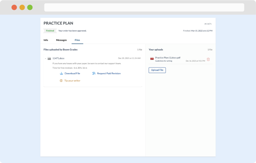
As soon as the writer has finished, it will be delivered both to the website and to your email address so that you will not miss it. If your deadline is close at hand, we will place a call to you to make sure that you receive the paper on time.
Completing the order and download