Fermoy House is a Bed and Breakfast Establishment that offers overnight stay and breakfast to its clients; the establishment has four bedrooms and a private cottage that is detached. The guest house allows only two people in each bedroom; as a differentiating factor, the guest house allows guests stay for up to two dogs in the attached kernels. To help them run their business, the guest house needs a website for this purpose. This paper is a design proposal for the website; it discusses an overview of the design concept, followed by a list of user and business requirements. The key assumptions are also discussed, along with a design of the interface, including wire-frames and justification for using them.
The design will take into consideration the functional and non functional aspects of the website (Chopra, 2016); the needs of the general public that will use the website will be given greater consideration (front end), but this will be matched with the needs of the business (back-end). The website design will be centered around the user and this will determine each and every decision taken during the design. The details of the website design will be given even greater attention, guided by the principle that details can make a ‘good’ web design ‘great’ so great attention will be paid to the details in order to maximize the user experience and make both the front end and back end users satisfied (Cederholm & marcotte, 2010). Focus will be placed on details such as legibility of text, contrast, use of color, and use of graphics. Sketching will be done a lot and the website developed incrementally using agile methods, with the client present most of the times to get immediate feedback and make instant changes. The design aim is a highly responsive web site that works seamlessly and flawlessly in every web browser with sufficiently contrasted elements with white space used t separate elements and blend them at the same time.
Visual performance will be given as much detail as technical performance of the website ; the website is being designed to solve a problem for the client and the website will be critiqued and constructive feedback obtained to further enhance and improve it. The website will follow the principles of web design and will be guided by the purpose for which the website is being constructed; to pass information, manage transactions, get user feedback, and to promote the guest house. The information being passed will be communicated clearly and concisely in a way that can be easily read and digested by the users. The typefaces used must be easy to read,even for users with visual challenges. The color palette to be used must enhance the visual appeal of the website, with a well balanced use and mix of colors that blend well to enhance the user experience. Images will be used liberally to pass information clearly and create interest in the guest house products, rather than using text; this will make the website rich and less cluttered with text or make the user have to read through a lot of text (Vu, 2011). The content will be designed to harness the natural behavior of users with ease of navigation and familiarity incorporated into all the web pages
Business requirements
User Requirements
List of key assumptions;
The Home Page
The design for the home page is shown below;
The home page is the most important part of the website because it gives the first impression about the guest house and its product offering. This page will aim at showing what the guest house offers with the main product being accommodation. So the main feature on the page will be an image of one of the best rooms the guest house provides to demonstrate to a would be customer its elegance and quality. When visiting a web page, people’s attention start from their left and then move to the right, before moving to the lower level/ center of the page (Laja, 2017). This principle has been utilized in this design by having a huge and prominent image of a room with a bed and other luxuries amenities such as artwork on the wall, nice lights for the room, a bed stand and a table stand. This is so as to create a feeling of relaxation for the visitor; the image should make them feel that they have ‘arrived’ in their search for suitable accommodation in the region. The image of the nice boutique room is placed on the left of the screen as this is where their eyes are likely to zero in first upon the page loading. A picture can say a thousand words and so the image is used with few or no words to create the feel of visiting a gallery or something grand that immediately appeals to the web page visitor without much explanation.
At the top towards the right, there is a main logo and on top of the image that is designed to grab attention and gradually as the eye moves towards the right, smaller buttons are used to create visual hierarchy and draw the viewers’ eye to look at the menu buttons. The buttons are placed in bright colors to further create visual hierarchy and draw the viewer towards the right so they can have an idea of what the guest house offers. Simple words with impact typer face are used for legibility and a different bold color is used to create contrast. This makes it easy for even persons with visual challenges to easily read and take in what the website has to offer/ is all about. Then as the eye moves down towards the center of the web page, there is another flashing image with special offers to tempt the web visitor to view what the hotel has on offer. The flashing image is designed to keep the visitor fixated on the center of the web page from were they can quickly absorb what else is on the website. On the immediate right of the ‘special offer’ button are links to other pages where the user can view the available rooms, make a reservation, seek help or post a query through the contact button.
On the bottom right is a live chat button that is placed in contrast (color and shape) to other buttons and will be designed to monitor the web browser activity and intelligently ‘welcome’ th visitor after some minutes with a message where the visitor can post a response. At the bottom are links to accreditations for the hotel and social media as well as a counter for web visitors. On the home page, color has been used judiciously to create simplicity as well as contrast. The color scheme used is meant to create a relaxed feeling that draws the visitor to stay longer on the website. The colors are used in a way that makes the visitors visit a rich and captivating one. When captivated, the visitor will be prodded to seek more information by clicking on other buttons and links. Contrast is used to focus the attention of the visitor on specific elements on the web site/ web page. The background has been made with a light color instead of white which would create monotony while the main content has rich dark/ bright colors. The background color used is beige which while helping create contrast, also helps make the elements in the website blend. Being is a calm, natural, and relaxing color, which is the main aim of the guest house; to provide a natural and clam environment where guests can relax and enjoy a good nights rest (Bourn, 2011).
The image of the rooms should continue this color scheme on walls with the bed having a brownish or earthy color which signifies wholesomeness, security, elegance, stability, warmth, homeliness, healing, and honesty. These are attributes that any traveler seeking accommodation would be looking for, so this color scheme is used. The buttons/ links on the right have a light blue background that create a feeling (signify) freedom, open spaces, stability, heaven, depth, trust, and sincerity. The guest house no doubt seeks to be associated with such high ideals where clients have freedom and what is written is what is on offer, including a free night stay for pets in the available kernels per night. The top buttons are in orange which is a bright color that signifies warmth, happiness, stimulation, change, success, encouragements, enjoyment and balance. The use of the color scheme is also aimed at blending with each other so that the web page is a continuation of the other, while the beige background contrasted with the bright/ darker colors for elements is aimed at creating a ‘floating feel’ with the beige background creating a feeling of depth (Bourn, 2011).
The website will appear as shown below;
Each web page is designed with a standard design frame with the buttons remaining the same. Only the content about the button, such as ‘Accommodation’ above changes and comes to the center of the screen. In this page, text is used based on the CSS (cascading style sheets) system for legibility and to give the user explanatory information that they can use to help them make a decision on the kind of rooms they want. Again, the same color scheme is maintained so that contrast is provided, but the elements in the web page blend in easily. Images are used to give the user an idea of the rooms and their rates; as stated earlier, the use of images and pictures of the rooms is important in passing information instantly to the customer without them having to read them through. The images and text are placed in a way that creates visual balance in the web page. This is based on the symmetry concept so that the web page appears ‘balanced’ in terms of the page elements (text, images, buttons) that are well spaced out to make it easy for the users to navigate through and for first time visitors to learn the website.
In website design, balance refers to the notion that elements are symmetrical; this in turn creates a feel of order, harmony, and cohesion in the design. The result of using balance and symmetry is aesthetically pleasing elements and content that the users’ mind finds to be complete. There is also an element of asymmetry where the text and images are placed on opposite sides above each other to create a break in the balance of the web page and creates an interesting outcome that breaks monotony. In this context, balance refers to an equal distribution of visual weight when designing; visual balance is achieved in a vertical axis as the eyes of a human requires the visual weight to be equal on both sides of the vertical axis. The web page has been designed both with symmetrical and asymmetrical balance; while vertical balance has also been used to orient the symmetrical design vertically. The same color scheme is maintained and used based on the principles of balance and symmetry to achieve visual color weight in the web page; the colors blend in and also contrast to achieve functional and visual objectives (Hamilton, 2011).
Clicking on the View Rooms Button Brings the Page Below;
When the view rooms button is selected, a pop up window comes up to tell the person browsing what to do next. In this way, the website becomes more interactive and easy to learn to use. Again, elements of visual weight and the use of earthly relaxing colors that would beckon someone to take a room at the guest house are used. The rooms are shown by their smaller images that when the user clicks are enlarged so that only a single image is visible at the center of the web page and the user can view the static image or have the option of a 360 degree view. When one wants to look at another room, they simply click the close button on the top right side of the enlarged image and return to the main web age where they can view other rooms. Enlarging an image results in basic information about the image being shown, including the price and availability in an interactive and fascinating manner. This is to achieve the functional goal of helping the potential customer make a decision.
Clicking on the Make Reservations Tab Opens a New Page
On Clicking the ‘make reservation’ button, a new web page on reservations is opened. This is an interactive web page where the user gets to in put and select the kind of rooms they want and also give other details including whether they have children accompanying them, the number of children, the length of time they expect to spend at the guest house, and the the date they plan to check in. again, white spaces are used to guide the user on where to enter information. Additional features are created, so that in the ‘check in date’ dialog box, a calendar comes up when the user clicks in the white space so they can easily select their expected check in date. This is also meant to make the web page easy to use and interactive. Notice that the basic layout of the web page remains standard in terms of the navigation buttons and their location. When the user wants to check something else, they can just quickly look up at the top of the page pr to the side and select a link from the provided buttons.
Clicking the meals button also opens a new page as shown below
The meals button leads to the meals page and the user can select the kind of meas they want which can be prepared in advance if they order, or enable them view what is on the menu. The buttons are used in a way that the overall color scheme is maintained while at the same time retaining contrasts. At the center of the page is a special offers button which is enlarged to draw the web users attention. Clicking any of the buttons opens up another page with the food items under the listed categories with images so the visitor can have a look and compare the prices.
Clicking the pets button leads to the pets page where there is text description of the pets program to educate the user. In this way, the web page serves as a tool for educating and informing the user with visual cues on the kennels shown in the image holders to provide the use with information on just what services are offered.
For a new client or even an existing one, the web page for log in/ details is designed such that the user can select all their desired rooms, items, pet food and kennel type, and even ask queries or post a question in the help tab. When done, a person is prompted to confirm and this automatically takes them to the log in/ registration page. If already registered, they will be asked to sign in; otherwise, the user will be asked to register and enter their details. This is shown below;
The details page is designed intuitively and interactively so that the text in the white spaces disappear to give way for the client to enter their details. Once they start typing, the letters in black disappear. When done, the user is asked to confirm their details and conclude the transaction, where upon they will be prompted by an e-mail of the transaction plus the transaction details. Before confirming their reservations and amounts to be paid, the website will provide a summary of the details in an invoice/ receipt form. Upon confirming, the user is automatically logged out; a prompt will also ask if they want to undertake any other transaction. Upon clicking any of the links, the color changes to Grey to show the user that they have already visited that page. This is an important aspect for ease of navigation of the website. The website is designed to be highly interactive, so that when a user logs in or enters their details, there is an indicator just next to the home button that shows the user who is logged in and their log in status. Any action relating to making a selection or order is captured in the shopping cart located on the top right corner of the web page. This is also interactive so that it automatically updates the shopping cart amount for every selection made.
Again, the website is designed with white color for the boxes where the users enter their details; this is to provide contrast for better visibility and the design is simple enough to enable anybody successfully make a reservation.
The overall design for each web page in the website maintains a similar color scheme to enable continuity and enhance ease of navigation. Retaining the same background design and color scheme creates familiarity and this is important, especially for first time users to quickly learn the website. The main buttons at the top, right side of the web pages, and at the bottom are also left the same so that a user can quickly navigate around the web pages and each button clicked gives the user a prompt below on what to do. The reason for adding such functionality is to make it easy for the user to navigate the website successfully. The color scheme used is geared to wards the nature of the business, with hospitable and welcoming soft cool, relaxing natural colors to make the web page user feel they are ‘right at home’. The elements are paced on the website in a balanced way to give symmetry, while the functional aspects of the website, including giving feedback and assisting the user are also incorporated. The desired design principle is that of simplicity and elegance, with a rich user experience that beckons the user to navigate further and sped more time on the website finding out information. The visitor may not make a booking/ reservation right away; however, their experience on the website will make them remember the name and website next time they want too travel or even make them recommend the guest house to a friend when using social media.
This design proposal concludes by stating that the website for The Fermoy House Bed and Breakfast has been designed following the design principles of simplicity, responsiveness, ease of use, ease of navigation, functionality, education, and feedback. A simple color scheme that blends with each other yet provides the right contrast to make navigation and finding information easy has also been used in the website.
References
Bourn, J. (2011). Meaning of The Color. Bourn Creative. Retrieved 24 December 2017, from https://www.bourncreative.com/meaning-of-the-color-orange/
Cederholm, D., & Marcotte, E. (2010). Handcrafted CSS: More bulletproof web design. – Description based on print version record. – Includes index. Berkeley, Calif: New Riders.
Chopra, R. A. J. I. V. (2016). Web Engineering. Place of publication not identified: Prentice-Hall Of India.
Hamilton, S. (2011). The Concept of Balance in Web Design. Onextrapixel. Retrieved 24 December 2017, from https://onextrapixel.com/concept-and-factors-of-balance-in-web-design/
Laja, P. (2017). 10 Useful Findings About How People View Websites. CXL. Retrieved 24 December 2017, from https://conversionxl.com/blog/10-useful-findings-about-how-people- view-websites/
Vu, K.-P. L. (2011). Handbook of Human Factors in Web Design. Hoboken: CRC Press.
Essay Writing Service Features
Our Experience
No matter how complex your assignment is, we can find the right professional for your specific task. Contact Essay is an essay writing company that hires only the smartest minds to help you with your projects. Our expertise allows us to provide students with high-quality academic writing, editing & proofreading services.
Free Features
Free revision policy
$10Free bibliography & reference
$8Free title page
$8Free formatting
$8How Our Essay Writing Service Works
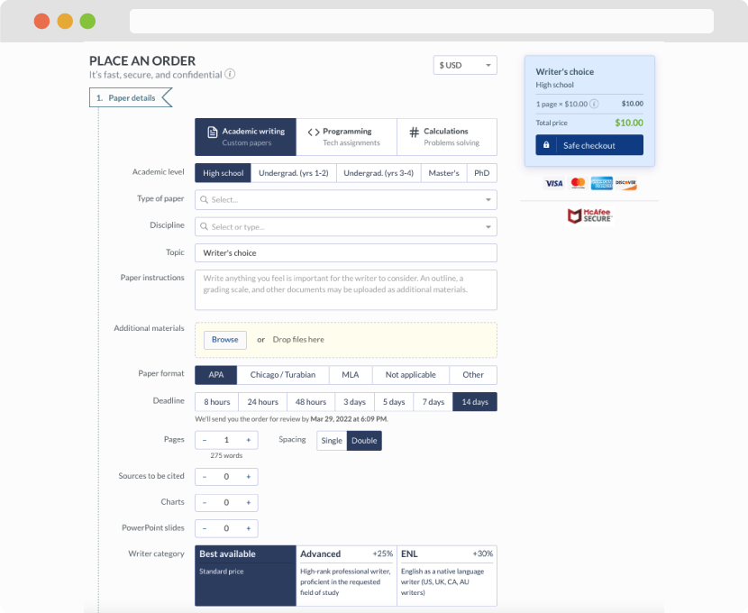
First, you will need to complete an order form. It's not difficult but, in case there is anything you find not to be clear, you may always call us so that we can guide you through it. On the order form, you will need to include some basic information concerning your order: subject, topic, number of pages, etc. We also encourage our clients to upload any relevant information or sources that will help.
Complete the order form
Once we have all the information and instructions that we need, we select the most suitable writer for your assignment. While everything seems to be clear, the writer, who has complete knowledge of the subject, may need clarification from you. It is at that point that you would receive a call or email from us.
Writer’s assignment
As soon as the writer has finished, it will be delivered both to the website and to your email address so that you will not miss it. If your deadline is close at hand, we will place a call to you to make sure that you receive the paper on time.
Completing the order and download