This is a report for the responsive web design analysis of a nominated website called https://maritimemuseum.com.au/ and its museum company website that is used to advertise the various activities that are carried out in the company vicinity.
This museum company is called Queensland Maritime Museum and is mainly located at Brisbane River at the southern end of South Bank Parklands where it operates to receive the visitors on daily basis apart from few days in a year which includes 24th December until 26th December and on the Good Fridays.
This company is among the best companies in Brisbane as it is able to have a low costs while admitting their visitors and also they have a wide variety of maritime display and hence able to attract quite big number of visitors who range from family members, schools groups, tourist group, interstates and also the international visitors.
Below are some of the purposes of writing this report about https://maritimemuseum.com.au/ which includes the following:
However there are various objective of this report which includes the following:
In the current computing error the website development had been on rise since it had been one of the major means that the companies uses to advertise their products and also communicate to their target customers .
However the websites developed are required to be responsive in nature to ensure that all their target audience and customers are able to receive the required information using any of the devices that they uses .
In this report there is nominated website that require to be analysed using the simulation tool to identify the major features and how those features can be improved.
However the responsive web design is the approaches that are used in designing the websites where all their web pages are able to render effectively on various devices, windows or the screens sizes. The responsive websites therefore are able to display the contents, designs and performances across the devices to ensure that they are usable and satisfying.
When the website is designed and adapts the devices can be viewed in various ways including fluid, proportion based grids and the flexible images and therefore implementation of responsive web design has facilitated improvement of the mobile internet traffics which accounts to more than half of the internet traffic.
In this report the nominated website is https://maritimemuseum.com.au/ which is a museum website and is used to advertise the maritime museum company which is located in Brisbane and mainly deals with tourism business where they hosts the visitors from various places and of different categories.
However the company website is made of various features which are important in attracting the website visitors in order to enable them visit the maritime museum.
The website features includes graphics, texts, website links, communication media, navigation maps, contacts details and slide shows which makes the website very interactive and appealing to the website audience and visitors.
Below are the various reviewing output using the various displays which includes the large, medium and tiny displays in both landscape and portrait format.
Desktop with 1280×768 pixels
Below is the desktop display which has 1280 x 768 pixels and mainly covers the large displays as shown below.
The above shows the large display on a desktop computer and the nominated website is able to cover the device screen effectively and all features are visible while others are visible after pulling the scroll bar downwards.
Mobile device with 480 x 640 pixels on portrait
Mobile device with 480 x 640 pixels on landscape
The above are the simulated medium devices displays where they are displayed in both portrait and landscape displays and they show that the nominated website is fully responsive.
Mobile device with 200 x 320 pixels on portrait
Mobile device with 200 x 320 pixels on landscape
The above are the simulated tiny devices displays of the nominated website where they are able to fit in the respective displays in both portrait and landscape and therefore the nominated website is termed to be responsive.
The maritime museum website is made of various features that make it more users friendly, attractive and responsive and they are recommendable in the process of website design.
Among the main features of the maritime website includes:
The maritine museum website is designed where it is added a logo and this is a very nice feature since it is essential in giving the quick site of the company’s name and the type of services they offer since it is a museum company and thus the visitors of the website are able to get more information about the company and also book an appointment to visit the company (Clarke, 2015,p.367).
The website has the navigation menu as another main feature where there are various links that are used by the visitors to navigate and move between the linked webs pages to read the information, however these links are important features since they are strategically located on the website for easy access to the website contents.
In this website the slide show is another important feature that is used by the website developers and this assist in the display of the features and images of the services that are offered by the museum, this slide show consist of the images that are very attractive to the viewers and end up attributing to the rise of the number of the new visitors to the museum (Holzschlag, 2014,p.542).
In this website there is the use of the map that is used to show the actual location of the company and this helps the visitors to know how they can navigate to the museum and how much time from their residence they can take to the museum.
The footer is the other essential feature used in the website where it make the website design attractive and also is used to hold the phone contacts and the email contacts details as well.
The contacts are very essential in the website where the visitors are able to call the help desk or even send an email address requesting some information or even booking for a tour or a visit day in the company.
The website has another good feature where it is compatible to the various visitors devices where some of the visitors uses their various devices to access the website over the internet and the website is able to appear well on the computer devices, mobile phones and tablets and thus the developers do not require to design different website designs for the various visitors.
The website is easy accessible to all people regardless of age and physical appearance where using the internet enabled devices the various users will be able to access the website with ease and therefore the website is able to cover a large set of audience and this ensures that the company information is spread to all the targeted customers.
In this website the features are well organised and this makes it possible to be easily usable, however even if this feature is neglected in other websites it is highly considered in this website and thus it end up making the website more attractive to various audiences, however the website is well planned with the sections and categories that makes the website features easy to find by the visitors and they are able to view the various company’s contents.
In this website the other feature is the well content format where the users and the website visitors just skims through the website content instead of reading the whole website pages from the beginning to the end of the web pages and this is achieved by having the key sections and words in the website.
This feature had been achieved through the use of the headings, sub-headings, paragraphs ,lists and bullets that are essential in breaking the texts that are easily scanned by the website visitors and readers.
This website also has other feature where the website is able to load quickly and thus this feature motivates the visitors since the website is able to load within 4-6 seconds without any errors , however this feature have a positive impact on the ranks of the search engine as well.
This website has another feature of consistency in the various browsers and the loading becomes more efficient, these inconsistencies that is caused by various browsers interpretation and thus while designing this website it was made consistent to all major browsers which includes chrome, internet explorer, Firefox, safari and opera and thus make this website look unique from the others.
This website has an error handling feature that sends some error messages on the screen of user’s devices and this makes the website to be highly usable by the website visitors and users since this feature makes the website to be highly robust and bugs free and thus the error messages essentially improve the experience of the user and the usability (Griffiths, 2015,p.158).
The valid mark up is another feature that had been used and this is used to endure that the best practices and standards are adhered to and thus making the website robust and hence the website users easily locates problems and troubleshoots where necessary.
Another feature of the website is the colour contrast where the website is designed where the background and the respective text is used appropriately, however the text which is black in colour with white backgrounds makes the website’s contents to be clear and legible with ease since the lack of contrast make it hard for the users of the website to read the contents (Grannell,2013,p.63).
The maritine museum website has various features and they make it to have some positive and negative aspects of the website which are as follows:
After the reviewing of the website two other independent reviewers were able to analyse the nominated website where they give their respective views as below.
This is the first reviewer who is a friend and reviewed the nominated website using the chrome device simulator, below is his personal details.
Age: 25 years
Gender: male
Profession: computer science.
This reviewer reviewed the website and found that his views were slightly different from mine due to the following reasons:
This is the second reviewer who is a classmate and reviewed the nominated website using the simulation tool, below is his personal details.
Age: 25 years
Gender: male
Profession: information technology.
This reviewer reviewed the website and found that his views were common with mine due to the following reasons:
The chrome device simulator being the tool used to simulate the various devices has various advantages and disadvantages as below:
The responsive test can be done using a number of simulation tools to test the responsiveness of the nominated tool and they are as follows:
It is a simulation device that is integrated within the Firefox browser and is used to carry out the responsiveness simulation (Freeman, 2015,p.110).
This is a chrome simulator and is integrated with the chrome browser as a plug-in and is meant to do the simulation.
It is a simulator used to test the responsive websites and is integrated with the browser as a plug-in and is also good to do simulation.
It is type of chrome responsive design simulator which is integrated in form of a plug-in and is used mainly for simulation purpose (Gasston, 2011,p.55).
The reviewing of the nominated website was able to give the over view of the major features that are important to the website and also identification of the weaknesses and thus below are some of the recommendations to improve the quality and service delivery of the nominated website.
Below are the various recommendations:
Conclusion
This report is about reviewing of the nominated website in order to identify the major features in it , however during the process the positive and the negative features were identified where the website was found to be fast in loading, it has good colour contrasts, it is well planned to facilitate good arrangement of the website features, it is highly accessible through many website users and visitors, it is a good website in terms of browsers consistencies, and it finally it is efficient in handling the errors.
However reviewing was carried out using the chrome device simulator which was able to simulate the appearance and the various visible features of the website while viewed in the various devices.
After the reviewing the nominated website and finding the conclusion, the same website was reviewed by other two reviewers using the same simulator tool, however the reviewing of the nominated website attracted various recommendations for improving the nominated website which includes the addition of the website contact form, the resizing of the webpage images, introduction of the navigation links on the footer to facilitate the website navigation and also reduction of the slide show images to improve the website loading speed.
References
Gasston, P. (2011) Book of CSS3. California:No Starch Press.
Freeman, E. (2015) Head First HTML with CSS & XHTML.3rd edn. New York:O’Reilly & Associates.
Gillenwater, Z.(2012) Flexible Web Design: Creating Liquid and Elastic Layouts with CSS.2nd edn. San Francisco :New Riders Press
Zoe, M. (2010) Stunning CSS3: A Project-based Guide to the Latest in CSS.4th edn. San Francisco:New Riders Press.
Grannell, C.(2013) The Essential Guide to CSS and HTML Web Design.1st edn. New York: Friends of ED.
Griffiths, P.(2015) XHTML & CSS: A Web Standards Approach.2nd edn.London: New Riders.
Holzschlag, M.(2014) Spring Into HTML and CSS.3rd edn.Boston: Addison-Wesley Professional.
Clarke, A. (2015) Transcending CSS : The Fine Art of Web Design.2nd edn. London :New Riders Press.
Essay Writing Service Features
Our Experience
No matter how complex your assignment is, we can find the right professional for your specific task. Contact Essay is an essay writing company that hires only the smartest minds to help you with your projects. Our expertise allows us to provide students with high-quality academic writing, editing & proofreading services.
Free Features
Free revision policy
$10Free bibliography & reference
$8Free title page
$8Free formatting
$8How Our Essay Writing Service Works

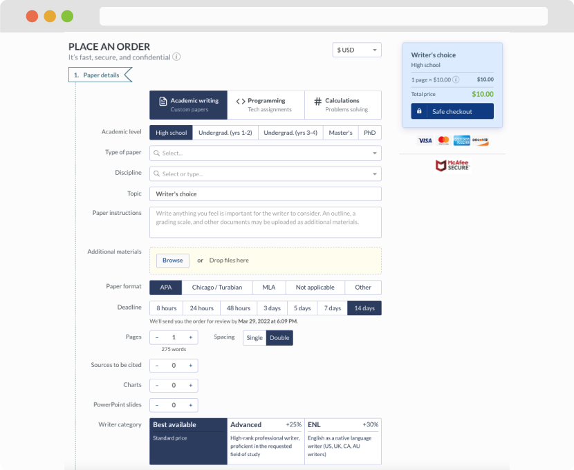
First, you will need to complete an order form. It's not difficult but, in case there is anything you find not to be clear, you may always call us so that we can guide you through it. On the order form, you will need to include some basic information concerning your order: subject, topic, number of pages, etc. We also encourage our clients to upload any relevant information or sources that will help.
Complete the order form
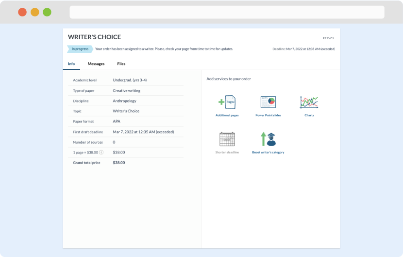
Once we have all the information and instructions that we need, we select the most suitable writer for your assignment. While everything seems to be clear, the writer, who has complete knowledge of the subject, may need clarification from you. It is at that point that you would receive a call or email from us.
Writer’s assignment
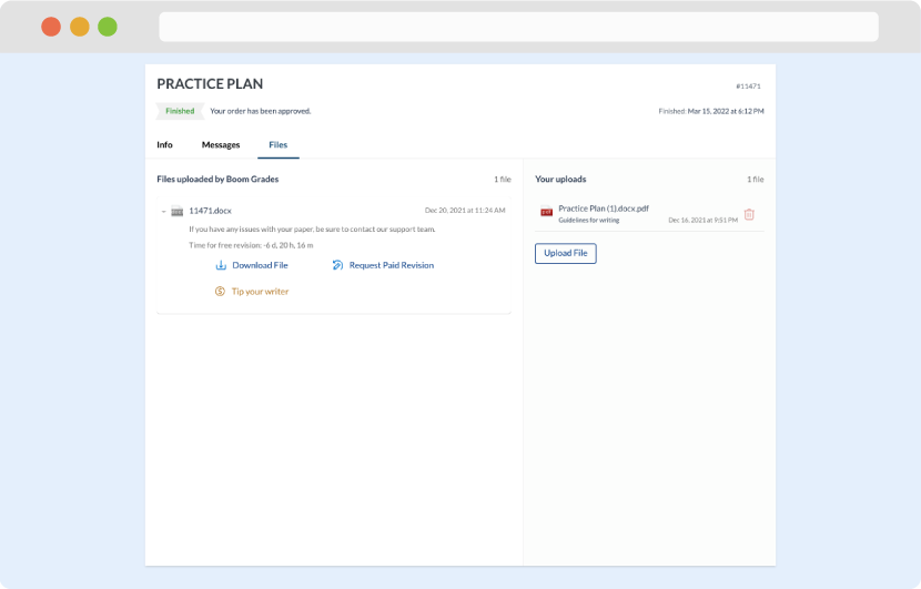
As soon as the writer has finished, it will be delivered both to the website and to your email address so that you will not miss it. If your deadline is close at hand, we will place a call to you to make sure that you receive the paper on time.
Completing the order and download