When choosing a usability evaluation method, it is important to understand what usability evaluation is. Usability evaluation evaluates how the interface of certain software or product works. How the test is conducted and how detailed the test can be, how it will react on tests and so on. For this study, heuristic evaluation is selected as the main analytical inspection method and for the empirical method, Usability Testing is selected.
Get Help With Your Essay
If you need assistance with writing your essay, our professional essay writing service is here to help!
Essay Writing Service
First introduced by Jakob Nielson in early 90’s, the evaluation for usability was created to enhance evaluation method by taking elements such as, user interface(Rogers and Preece, 2007, p.686), dialog boxes, menus, navigation structure , online help and etc.(Rogers and Preece, 2007, p.686). This evaluation method was called heuristic evaluation and when it’s early establishment, usability evaluation guideline has a long list of method (Nielsen and Molich, 1990), and Nielson shorten the list to only ten of main heuristic evaluation which is(Nielsen, 2005);
Visibility of system status: The system should always keep users informed about what is going on, through appropriate feedback within reasonable time.
Match between system and the real world: The system should speak the users’ language, with words, phrases and concepts familiar to the user, rather than system-oriented terms. Follow real-world conventions, making information appear in a natural and logical order.
User control and freedom: Users often choose system functions by mistake and will need a clearly marked “emergency exit” to leave the unwanted state without having to go through an extended dialogue. Support undo and redo.
Consistency and standards: Users should not have to wonder whether different words, situations, or actions mean the same thing. Follow platform conventions.
Error prevention: Even better than good error messages is a careful design which prevents a problem from occurring in the first place. Either eliminate error-prone conditions or check for them and present users with a confirmation option before they commit to the action.
Recognition rather than recall: Minimize the user’s memory load by making objects, actions, and options visible. The user should not have to remember information from one part of the dialogue to another. Instructions for use of the system should be visible or easily retrievable whenever appropriate.
Flexibility and efficiency of use: Accelerators — unseen by the novice user — may often speed up the interaction for the expert user such that the system can cater to both inexperienced and experienced users. Allow users to tailor frequent actions.
Aesthetic and minimalist design: Dialogues should not contain information which is irrelevant or rarely needed. Every extra unit of information in a dialogue competes with the relevant units of information and diminishes their relative visibility.
Help users recognize, diagnose, and recover from errors: Error messages should be expressed in plain language (no codes), precisely indicate the problem, and constructively suggest a solution.
Help and documentation: Even though it is better if the system can be used without documentation, it may be necessary to provide help and documentation. Any such information should be easy to search, focused on the user’s task, list concrete steps to be carried out, and not be too large.
These sets of rules or guideline set the benchmark on how to evaluate usability on interface designs. For example, Mook (2008) research on Microsoft Windows XP Usability testing that is conducted by Bloomberg University, Washington shows that several functionality testing is conducted with the participation of students from the same University, such as setting up an email account, writing an letter, saving a letter copy and sending the final were the part of a important study on how those interface function works.
Heuristic Evaluation Strength
Heuristic evaluation can be seen as one of the usability methods that is knows as Usability discount engineering (Useit, 2001). The main advantages of Heuristic Evaluation can be verified as cost efficient, intuitive, planning on evaluation doesn’t need any advance feature and it can be used easily in early development phases (Nielson and Molich, 1990).
Cost Efficient: Cost Efficient or cheap means that it can be implemented in any development phases. For example, when creating a System, evaluation can be done on interfaces that are in Prototype Development Phase. This evaluation can be easily done without jeopardizing the cost when evaluating.(Cockton et.al, 2003)
Intuitive: Intuitive means that is it easy to ask people to evaluate using Heuristic evaluation method, for example, evaluation can be done both by students or professionals and independently. (Nielsel and Molich, 1990).
Advance Planning not required: Heuristic Evaluation also doesn’t need advance planning prior to evaluation, meaning that it is evaluated with the rules or guidelines, with reference to Ten Usability Guidelines.
Can be used easily in early development phases: Evaluation or test can be done before the final finished product is out. Meaning that it can be tested within the “prototype” or “beta” version of the product.
Heuristic Evaluation Weakness
Not currently solving identified problems: According to Nielson and Molich (1990), one of the disadvantages of Heuristic evaluation is problem are identified regardless of suggestions how to solve them. For example, once the problem has been identified, evaluator’s doesn’t tend to get information for how to resolve the current problems.
Working on multiple number of problems: As suggested by Nielsen and Molich (1990), evaluators just tend to identify several small usability issues, though several more are experts are useful to identify multiple problems.
Not suitable on complex interfaces: Because in heuristic evaluation uses small amount of evaluators, they tend to missed out several issues, such as minor issues in complex interfaces.
Usability Testing
Description
The approach for Usability Testing is the test that is conducted toward a product or website to ensure that the product or website is in functional state. Meanwhile, empirical uses more approach towards the thorough observation of the current system. The goal of Usability Testing is to get feedback from users whether the product that is being developed is usable by its standards. Usability testing in earlier days is conducted to investigate the usability efficiency features on interfaces (Rogers and Preece, 2007, p.646). For example, tests conducted on twelve students, by the Wichita State University (Lenz, 2008), to test usability of several gaming peripherals, such as gaming joystick, gaming pad and mouse. Participants of this test firstly need to fill out a questionnaire based on their gaming experience (Lenz, 2008) and their objective is to eliminate 15 enemy robots as quickly and efficiency as possible (Lenz, 2008). These results are recorded and later processed to be viewed as a full video. Data recorded such as how many enemies killed, time to be taken to kill an enemy and how many shots fired per kill are recorded (Lenz, 2008). Usability testing is divided into two groups, which is analytical and empirical, the analytical method means that the evaluated system are thoroughly checked and examined to crucially identify problems.
Usability Testing Strength
Usability Testing is a procedure that ensures that the final product is meeting the current specification and doing the tasks it supposed to do. Several advantages of Usability Testing can be identified, such as direct feedback from users, how to react to problems and resolving potential problems, if arises (McGregor, n.d)
Direct Feedback from Users: Getting the required feedback from users is one of the advantages when using the usability testing. For example, questionnaires are such tools when using usability testing. Hands on user’s usage on interfaces are also one of the direct feedbacks that are used in usability testing. For example, testers on interactive websites can directly interact with websites and gives feedback to evaluators respectively.
How to react to current problem: If problem arises, evaluators can react directly to specific problems and options. For example, when evaluating websites, if certain links are not working, the evaluators can directly spot the problems
Resolving potential Problems: Launch of the final product can be done and fixing by the final product is launched. For example, once the problems are spotted, any problems can be fixed in mean time before the product is finalized.
Usability Testing Weaknesses
Costly in regards of equipment, staffing and facility: For example, when conducting tests, costs of equipment can be high, because of setting up of computers, questionnaires and so on.
Analysis of data collected is complex: Once the tests are conducted, evaluators need to analyze those data. Usually these data are complex, for example going through hundreds of questionnaires to get the final data, this create more time consuming on staff.
Require commitments by testers: For example, test on websites with a 10 students currently testing interfaces on websites will need full commitments of students, thus creating inflexible time rate with the testers.
Task 2
Introduction
LiveAtc Website is a live Air Traffic Control online website that enables visitors to hear live ATC from various airports in the world. Although overall look of the website is reasonable, but there are number of issues that will cause problems for users visiting to the site. Using heuristic evaluation of the website, users will generally satisfy when visiting the site.
Heuristic Evaluation
Heuristic Evaluation will be used upon evaluating of the website. The basic ten general heuristic are;
Visibility of system status.
Match between system and the real world.
User control and freedom.
Consistency and standards.
Error prevention.
Recognition rather than recall.
Flexibility and efficiency of use.
Aesthetic and minimalist design.
Help users recognize, diagnose, and recover from errors.
Help and documentation.
Evaluated Website: http://www.liveatc.net
Date Accessed: 20 November 2010.
Nielsen(n.d) also suggested that a scale rating from 0(Zero) to 4(Four) should be used to identify the severity of the problem.
Rating
Description
0
No Usability Problem At All.
1
Cosmetic problem only; need not be fixed unless extra time is available on project.
2
Minor usability problem: fixing this should be given low priority.
3
Major usability problem: important to fix, so should be given high priority.
4
Usability catastrophe: imperative to fix this before product can be released.
Table 1: Nielsen recommended severity table.
Problem 1
Brief description of problem: Color hyperlink coding not available thus denying link recognition
Problem for User: User has to remember each link page before moving to another one, thus making problem remembering where they’re left before.
Heuristic conformed to: Recognition rather than recall, because User has to recall where they’ve been before rather than having color hyperlink recognition.
Severity of the problem: Rating number 3; Major usability problem: important to fix, so should be given high priority.
Problem 2
Brief description of problem: Website doesn’t have any back button to the link before it, thus making user have to use the back browser button instead.
Problem for User: User will have problem navigation from each link to another without a back or forward button.
Heuristic conformed to: User control and freedom, because user doesn’t have any control and freedom for each link, thus will limit them on going back and forward on each link.
Severity of the problem: Rating number 4, Usability catastrophe: imperative to fix this before product can be released.
Problem 3
Brief description of problem: Website design is complicated. Banner and icons are not properly aligned. Webpage width and size for different links are not standardized. The content copyright footer doesn’t align properly.
Problem for User: On some pages, User have to scroll down to just click the “About” button, because there is no standardization between web links within the pages.
Heuristic conformed to : Consistency and standards , because the website doesn’t have consistency and standards such as , between pages, there is no standard size or page limit, certain web links have different size and confusing links.
Severity of the problem: Rating number 3, Major usability problem: important to fix, so should be given high priority.
Problem 4
Brief description of problem: On the Frequently Asked Question (FAQ) page, it links to another site, which is a forum site. This hinder user from get “quick” help from the website but rather have to “ask and wait” for a required help.
Problem for user: User would have to search from a long list of FAQ and by the end of the list; they might not find the required answer. Asking in a forum would just make the user wait for answers rather getting the answer immediately.
Heuristic conformed to: Help and documentation, because of the nature of the FAQ given on the site, long lists of FAQ are given. But not all would cater the needs of the user and the FAQ link is not so helpful on users.
Severity of the problem: Rating number 2, Minor usability problem: fixing this should be given low priority.
Problem 5
Brief description of problem: Website doesn’t have an effective navigation menu. For example, the main page has a poor navigation menu. Links are not properly justified and creates confusion.
Problem for User: User often gets confused on whether the link is “as one” or not because there is no separation between links.
Heuristic conformed to: Visibility of system status. This is because lack of features such as effective navigation menu hinders the user to have easy usability of the website.
Severity of the problem: Rating number 2, Minor usability problem: fixing this should be given low priority.
Problem 6
Brief description of problem: There is no accessibility features for users who has problems viewing the icons and fonts on the website. Zoom feature or enlarging the site features should help.
Problem for user: User who have accessibility problem will have difficulties going through the site as there is no accessibility features such as font enlargement or “zoom” features.
Heuristic conformed to: Flexibility and inefficiency of use, because accessibility features are not anywhere in the website or in their links.
Severity of the problem: Rating number 2, Minor usability problem: fixing this should be given low priority.
Summary
According to Nielsen (n.d), related usability problem can be found in four ways, that is, in a single location in the interface, at two or more locations that have to be compared to find. Overall structure of the problem interface and something that can be included in the interface but it is missing. In the Heuristic evaluation done above, the biggest single problem with the LiveAtc website is that, the design is too simple and would only cater with experienced visitor or user. Although problems can be identified more than six (6), but the most obvious problem is what has been evaluated above. Problems would occur if inexperience visitor is browsing through the site and would have difficulties such as navigating and understanding regardless the anonymity of the un-standardized of some web links it has. Severity rating when evaluating the website was from two (2) to four (4) rating, with reference to the Nielsen Severity Rating table. This shows that the website has problems range from cosmetic until problems that need to be fixed before publishing it to the internet. According to Nielsen experience with rating severity in heuristic evaluation (Nielsen, n.d), he suggested that, severity ratings from a single evaluator are too unreliable to be trusted and recommend a three (3) evaluator when doing heuristic evaluation. Accuracy and reliability of rating severity determines from how complicated the product or website that would want to be evaluated. LiveATC website is a very simple website and when judging from the Nielsen experience when rating severity, it could be that the accuracy of the evaluation would be more reliable because of the simplicity of the website evaluated.
Essay Writing Service Features
Our Experience
No matter how complex your assignment is, we can find the right professional for your specific task. Contact Essay is an essay writing company that hires only the smartest minds to help you with your projects. Our expertise allows us to provide students with high-quality academic writing, editing & proofreading services.
Free Features
Free revision policy
$10Free bibliography & reference
$8Free title page
$8Free formatting
$8How Our Essay Writing Service Works

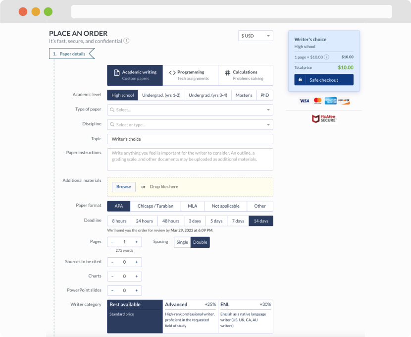
First, you will need to complete an order form. It's not difficult but, in case there is anything you find not to be clear, you may always call us so that we can guide you through it. On the order form, you will need to include some basic information concerning your order: subject, topic, number of pages, etc. We also encourage our clients to upload any relevant information or sources that will help.
Complete the order form
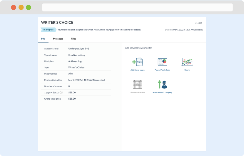
Once we have all the information and instructions that we need, we select the most suitable writer for your assignment. While everything seems to be clear, the writer, who has complete knowledge of the subject, may need clarification from you. It is at that point that you would receive a call or email from us.
Writer’s assignment
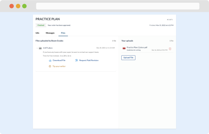
As soon as the writer has finished, it will be delivered both to the website and to your email address so that you will not miss it. If your deadline is close at hand, we will place a call to you to make sure that you receive the paper on time.
Completing the order and download