Discuss about the Website Review and Human Computer Interaction.
The human computer interaction is the study of individuals interacting with the system. In this report the website of Kakadu National Park has been considered as the system (web based) and the three selected users are the individuals.
The “Kakadu National Park” is the secured area situated at the Northern Territory, Australia. It has been special for its traditional aboriginal owners managing in partnership with the “Parks Australia” (Andersen, Humphrey & Braby, 2014). The following report explores the various features of user interactions. The various capabilities of the site to deliver informative and user-friendly surfing with proper questionnaire as surveys are prepared for the assessment.
The navigation of the primary site is placed well. It has been very simple to use and find. Despite this, it has not been consistent throughout the site. It has been changing unexpectedly and suddenly. This must be possibly become very confusing for the users (Baecker, 2014).
The addition of the “height” and “width” attributes must be done to every image tags. The specification of those attributes must remain similar to the “source image”. CSS, could be used if further resizing of the image in the surfing browser is needed to be done (Carr, 2015).
The site has given a lot of attention on the visual design. This has gained the trust of the audience. The “color palette” has been clear (Turk, 2014). The usage of the subtle shadows and gradients has provided the site with additional polish.
The site appears with the “parallax scrolling” with the images and video galleries. As a result the visitors are able to view outstanding visual content. The texts have been formatted attractively to guide the imagery supporting the storytelling throughout.
Every links has been well defined. This would help the search engine optimization and aid receptiveness. The site has used proper URLs or web addresses all over. This has been helpful for the usability, marketability and placement of the search engine.
There has been 57 words each page in an average. The quantity of content on the site is displayed to relate with the “search engine ranking”. The quantity of text in the site is needed to be considered. If appropriate, it could be increased (Saini, 2015).
The site has simply displayed the putting of things at unexpected locations. This might risk in unnoticing them by the users at the time of requirement. However, there has been no phenomenon of development of advertisements or any banner blindness while browsing the site. As anyone search for particular information in the site, he concentrates only on that parts of the pages where they think the relevant data to be present (Kim, 2015). This might be in the form of small text or hyperlinks.
The framework that characterizes the human-computer interaction is cognitive. It is dominant in nature. The cognition has been that flows in human mind while carrying the daily activities. It refers to the method by which human beings are familiarized with things. In other words, it is the process to gain knowledge (Willett, 2014). It includes the remembering, reasoning, acquiring of skills and creation of new ideas, attending, understanding and being aware. The theoretical background of this method evolves out from the “cognitive psychology”. It helps to explain the way in which human beings are capable of achieving their desired success. The cognition is described in terms of some particular processes. They are:
Its task is to fetch how data has been acquired from the outside world. Then it is transformed into experiences. The inevitable implication of this has been to develop representations that were already perceivable. Examples of this include the legibility of texts and easy readability, distinction of icons and so on.
For attention, the selections of objects to focus on the materials outside are meant at a particular moment of time. The focusing and division of attention has enables to become selective about the quantity of competing stimuli. However, it limits the ability of human beings to put up tracks for every event. The data in the admixture of human and computers is structured to hold back the attention of users. For example the usage of non-cognitive boundaries or windows, flashing lights, sound and reversing videos.
The “design implications” for “attention” has been making the data salient when attention of it is needed. Using techniques which create things standing out like the animation, colouring, and spacing, sequencing and ordering are done. The cluttering of information is avoided (Saini, 2015). For example the simple design and crisp of google.com could be considered. It further avoids using more as the software allows that.
The users have been developing the understanding of systems by using and learning it. The knowledge has been referred to as the mental model. The concerns have been to use the system and determine the next step. The steps to do with the unfamiliar or unexpected systems and situations are considered. The human beings create inferences by the “mental models” determining the way to execute tasks.
It is a consistent and accurate portrayal of the destination system as controlled by the expert user or the designer. From the side of the designer, the requirement has been to impose impacts on the “user’s model” (Wiese & Mcconnell, 2014). This is done to acquire the “conceptual model”, underpinning the aspects that are relevant to the system. This is accomplished by using language, tutorials, documentation, graphics and metaphor. This is significant as all those materials combine and relate with each other to encourage the similar model.
The research on human-computer interaction is expanded further on its origin in the “cognitive methods” of the individual users. This is done to involve the organizational and social processes for usage of computers. It is done in the “real environment”. It is also done as the usage of computers with collaboration.
The assessment of the knowledge of users comprises of the generic data that could be utilized for various reasons. The knowledge of any “user’s expertise” over a particular subject has been useful. This might be in any situation where communication with the user could be done. The interfaces adapt to the various users (Wiese & Mcconnell, 2014). Particular user groups like the programmers and secretaries and the expert level should be adjusted by them. For example, the level of expertise in a specific group can be determined by a secretary who could be somehow familiar with a particular text processor. However, the adaptability has been recognized as a significant aspect and few systems possess the ability of adapting to the expertise and user’s level.
The constraining design concept refers to the determining the methods to restrict the user interaction. This could take place at any moment of time. There has been various ways to achieve this (Bestley & Noble, 2016). One of such common practice of design in the GUI has been to deactivate specific “menu options” by blurring them. Thus the restriction of the human beings is done only within the permissible actions. The benefit of this type of constraining has been to prevent user from the selection of improper option. Thereby the refusal of the chances to make mistakes is done. The classified constraints normally contain three categories. They are the “physical”, “logical” and “cultural” (Lupton & Phillips, 2015).
The website has been review by the three users. The review has been done based on two aspects such as the information about the activities to be done in the Kakadu National Park and how to plan a trip through the website.
The First User Review: The first user that has been selected is a friend. According to the user, the has a great color combination. The interface and functions of the home page is very impressive. The user also stated that booking passes for a trip is very easy. All the necessary hyperlinks were available in the page.
The Second User Review: The second user is an old relative. According to the second user, the visual journey option really helped in assuming the amount of days needed to be spent in the park for trying all the activities. The activities to be done in the park are nicely described in the website with pictures of the places. Planning a journey was very easy as all the information was available at the site.
The Third User Review: The third user is a colleague. As per the user review, the site is completely full of all the information required. The user did not need to search anything in other search engines for gathering more knowledge before planning a trip. The booking process is very simple.
Conclusion:
The official website of the “Kakadu National Park” must improve the performance of the site with improved “site architecture and the navigation scheme”. The cluttering of information could be avoided. For example the simple design and crisp of google.com could be considered.The primary aim of the human-computer interaction is to represent and make sense about the interaction between computers and human beings. This is done by considering the way in which knowledge has been transmitted between them. The inputting into the machine comprise of the sensed data about the material world. The good example of this could be given about the mouse that senses the movement across a plane. This is done in collaboration with the keyboard detecting the contact closure as the key is pressed by the user. The usage of different types of “graphical representations” also constrains interpretation of problems or the data space of any person. Let the example of the flow-chart diagram be taken. There the objects have been related constraining the path in which the data could be perceived.
Padded Block Links in the Footer: In terms of increasing the usability, the designer can add padding or convert the link into block element. This will allow the users to click on the outside of the texts to access the links. It is useful for the elderly persons.
Use of Color for Managing Attention: The designers can make use of the colors for putting the focus of the users into the particular sections of the texts. The designers can use the various color combinations in the activity pages as well as other pages.
Navigation: The designer perhaps provide the option of booking the passes in the homepage. This will allow the users to save more time. On the other hand, the link to the booking page must be at menu of every page.
Andersen, A. N., Humphrey, C., & Braby, M. F. (2014, June). 4. Threatened invertebrates in Kakadu National Park. In Kakadu National Park Symposia Series (p. 48).
Baecker, R. M. (Ed.). (2014). Readings in Human-Computer Interaction: toward the year 2000. Morgan Kaufmann.
Bestley, R., & Noble, I. (2016). Visual Research: An Introduction to Research Methods in Graphic Design. Bloomsbury Publishing.
Booth, P. (2014). An Introduction to Human-Computer Interaction (Psychology Revivals). Psychology Press.
Carr, G. L. (2015). Website Review: Charles Darwin’s Beagle library.
Hasan, H., & Abdul-Kareem, S. (2014). Human–computer interaction using vision-based hand gesture recognition systems: a survey. Neural Computing and Applications, 25(2), 251-261.
Hinckley, K., Jacob, R. J., Ware, C., Wobbrock, J. O., & Wigdor, D. (2014). Input/Output Devices and Interaction Techniques.
Kim, G. J. (2015). Human–Computer Interaction: Fundamentals and Practice. CRC Press.
Ligman, J. W., Pistoia, M., Ponzo, J., & Thomas, G. (2016). U.S. Patent No. 9,372,779. Washington, DC: U.S. Patent and Trademark Office.
Lupton, E., & Phillips, J. C. (2015). Graphic Design: The New Basics: Revised and Expanded. Chronicle Books.
Möller, A., Kranz, M., Diewald, S., Roalter, L., Huitl, R., Stockinger, T., … & Lindemann, P. A. (2014, April). Experimental evaluation of user interfaces for visual indoor navigation. In Proceedings of the 32nd annual ACM conference on Human factors in computing systems (pp. 3607-3616). ACM.
Saini, S. D. (2015). Website review: review of patient-oriented websites for colorectal cancer screening. Gastroenterology, 148(3), 661-662.
Turk, M. (2014). Multimodal interaction: A review. Pattern Recognition Letters, 36, 189-195.
Wiese, K., & Mcconnell, D. A. (2014, December). Designing and Using Videos in Undergraduate Geoscience Education-a workshop and resource website review. In AGU Fall Meeting Abstracts (Vol. 1, p. 03).
Willett, P. (2014). Open Folklore: project and website review.
Essay Writing Service Features
Our Experience
No matter how complex your assignment is, we can find the right professional for your specific task. Contact Essay is an essay writing company that hires only the smartest minds to help you with your projects. Our expertise allows us to provide students with high-quality academic writing, editing & proofreading services.
Free Features
Free revision policy
$10Free bibliography & reference
$8Free title page
$8Free formatting
$8How Our Essay Writing Service Works

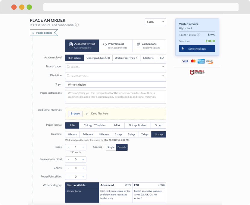
First, you will need to complete an order form. It's not difficult but, in case there is anything you find not to be clear, you may always call us so that we can guide you through it. On the order form, you will need to include some basic information concerning your order: subject, topic, number of pages, etc. We also encourage our clients to upload any relevant information or sources that will help.
Complete the order form
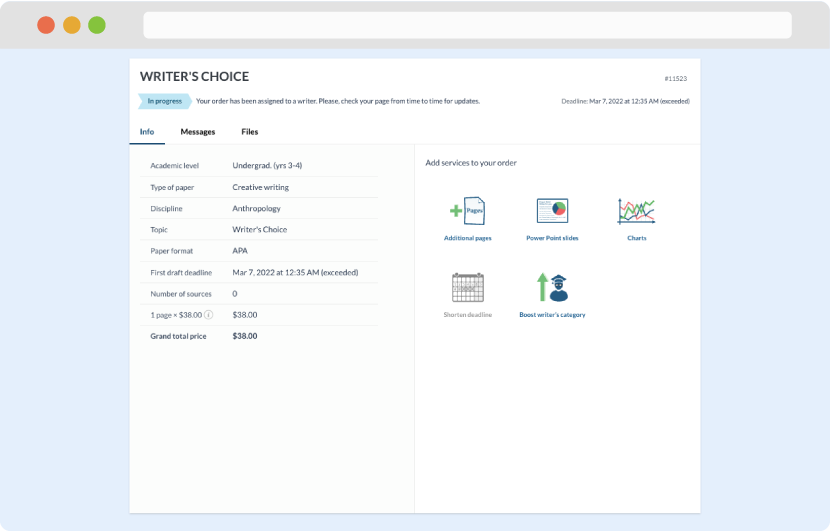
Once we have all the information and instructions that we need, we select the most suitable writer for your assignment. While everything seems to be clear, the writer, who has complete knowledge of the subject, may need clarification from you. It is at that point that you would receive a call or email from us.
Writer’s assignment
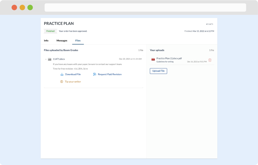
As soon as the writer has finished, it will be delivered both to the website and to your email address so that you will not miss it. If your deadline is close at hand, we will place a call to you to make sure that you receive the paper on time.
Completing the order and download